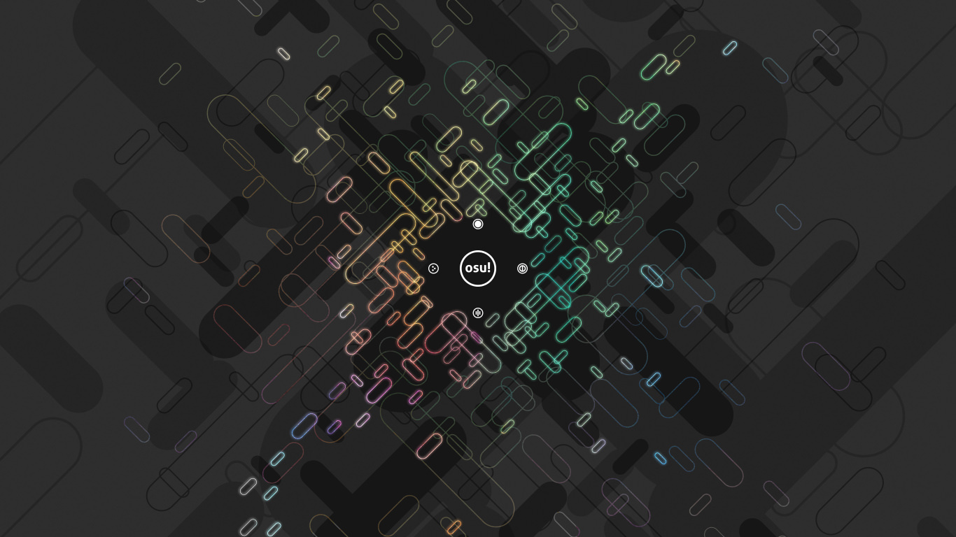
Menu Files
Button
Use same height as other button pieces.
Tinting varies by button state.

This element is stretched to fit the needed width.
Use same height as other button pieces.
Tinting varies by button state.

Use same height as other button pieces.
Tinting varies by button state.

Mod Icons

Click the Auto mod icon to see this icon.


This element is osu!mania-specific.


This element is osu!mania-specific.
Cycle through the xK mods to view.

This element is osu!mania-specific.
Cycle through the xK mods to view.

This element is osu!mania-specific.
Cycle through the xK mods to view.

This element is osu!mania-specific.

This element is osu!mania-specific.
Cycle through the xK mods to view.

This element is osu!mania-specific.
Cycle through the xK mods to view.

This element is osu!mania-specific.
Cycle through the xK mods to view.

This element is osu!mania-specific.
Cycle through the xK mods to view.

This element is osu!mania-specific.
Cycle through the xK mods to view.

This element is osu!mania-specific.

This element is osu!mania-specific.

Click the Double Time mod icon to see this icon.


Click the Sudden Death mod icon to see this icon.

This element is osu!mania-specific.


This element is osu!-specific mod.
This mod will move the cursor for the player while the player just needs to tap or click.


This element is osu!-specific mod.


This mod is available in the cuttingedge stream only.
This element is an osu!-specific mod.

This mod does not have an image in-game.
This mod does not show up in the mod selection or leaderboards.
Indicator for plays with certain mods and combinations.
- Does not show up if only ‘Score V2’, ‘Auto’, ‘Double Time’, ‘Nightcore’, or ‘Half Time’ by itself is used, combinations with other mods including them will show the mod.

This mod does not have an image in-game.
This mod does not show up in the mod selection.
Indicator for plays done using a touchscreen.
- The client uses a background algorithm to calculate if a play is done with a touchscreen, if too many cursor warps occur it might be applied to a play.

Cursor
By default, this element will rotate and expand (on click).
skin.ini commands:
- To disable cursor expand (on click), set
CursorExpandto0. - To disable cursor rotate, set
CursorRotateto0.
- To disable cursor expand (on click), set

This element does not rotate nor expand (on click).
This element is above the
cursor.pngelement.

This element is used when the player presses the smoke key.
- By default, the smoke key is bound to
C.
- By default, the smoke key is bound to

This element is underneath the
cursor.pngelementIf
cursormiddle.pngis present, a longer trail is used.By default, this element does not rotate.
skin.ini command:
- To enable cursortrail rotate, set
CursorTrailRotateto1.
- To enable cursortrail rotate, set

This element is used when the player presses the Left-Click key or Right-Click key on their keyboard or mouse.
- By default, the Left-Click key is bound to
Z. - By default, the Right-Click key is bound to
X.
- By default, the Left-Click key is bound to

Countdown
This should either say “1” or “3”.

This should say “2”.

This should either say “3” or “1”.

This should say “Go!”.

This should say “Are You Ready?” or “Ready?”.

Game Mode Indicators
This element flashes in the centre of the song select screen in respect of the song’s BPM.
Select osu! for this to be visible.

This element flashes in the centre of the song select screen in respect of the song’s BPM.
Select osu!taiko for this to be visible.

This element flashes in the centre of the song select screen in respect of the song’s BPM.
Select osu!catch for this to be visible.

This element flashes in the centre of the song select screen in respect of the song’s BPM.
Select osu!mania for this to be visible.

This element is used inside the game mode selection dropdown menu.
Click on
selection-mode.pngto see.

This element is used inside the game mode selection dropdown menu.
Click on
selection-mode.pngto see.

This element is used inside the game mode selection dropdown menu.
Click on
selection-mode.pngto see.

This element is used inside the game mode selection dropdown menu.
Click on
selection-mode.pngto see.

This element is on top of the
selection-mode.pngelement.Select osu! for this to be visible.
If the
menu-snow.pngelement is not skinned, this element will be used if it is selected.

This element is on top of the
selection-mode.pngelement.Select osu!taiko for this to be visible.
If the
menu-snow.pngelement is not skinned, this element will be used if it is selected.

This element is on top of the
selection-mode.pngelement.Select osu!catch for this to be visible.
If the
menu-snow.pngelement is not skinned, this element will be used if it is selected.

This element is on top of the
selection-mode.pngelement.Select osu!mania for this to be visible.
If the
menu-snow.pngelement is not skinned, this element will be used if it is selected.

Grade Letters
Positioning varies:
- 192px away from right screenborder
- v1.0: at 272px height
- v2.0+: at 320px height

Origin varies:
- Break: Centre
- Song Select panel: Left
- User scores: Centre

Positioning varies:
- 192px away from right screenborder
- v1.0: at 272px height
- v2.0+: at 320px height

Origin varies:
- Break: Centre
- Song Select panel: Left
- User scores: Centre

Positioning varies:
- 192px away from right screen border
- v1.0: at 272px height
- v2.0+: at 320px height

Origin varies:
- Break: Centre
- Song Select panel: Left
- User scores: Centre

Positioning varies:
- 192px away from right screen border
- v1.0: at 272px height
- v2.0+: at 320px height

Origin varies:
- Break: Centre
- Song Select panel: Left
- User scores: Centre

Positioning varies:
- 192px away from right screen border
- v1.0: at 272px height
- v2.0+: at 320px height

Origin varies:
- Break: Centre
- Song Select panel: Left
- User scores: Centre

Positioning varies:
- 192px away from right screen border
- v1.0: at 272px height
- v2.0+: at 320px height

Origin varies:
- Break: Centre
- Song Select panel: Left
- User scores: Centre

Positioning varies:
- 192px away from right screen border
- v1.0: at 272px height
- v2.0+: at 320px height

Origin varies:
- Break: Centre
- Song Select panel: Left
- User scores: Centre

Positioning varies:
- 192px away from right screen border
- v1.0: at 272px height
- v2.0+: at 320px height

Origin varies:
- Break: Centre
- Song Select panel: Left
- User scores: Centre

Key Counter

Positioning varies for each key:
- 24px away from screenborder
- K1/L: at 350px height
- K2/R: at 398px height
- M1/D: at 446px height
- M2: at 492px height
Toggleable in the options.
Shrinks briefly when the keys are pressed.
Tinting varies by button location and state:
- White, if key is not pressed.
- Yellow, if the key is pressed and located on the top half.
- Purple, if the key is pressed and located on the bottom half.

Leaderboard
This element is used for the in-game leaderboards and input overlay.
- For input overlay, the initial button labels are not skinnable.
Tinting depends on use:
- Score: white
- Combo: cyan
- Input overlay: use
InputOverlayTextvalue from skin.ini or black, if not defined
Origin varies on use:
- Score: Top Left
- Combo: Top Right
- Rank: Top Right
- Input overlay: Top

This element is used for the in-game leaderboards.
This element is used as the decimal separator.
- Usage depends on your selected language.
Tinting depends on use:
- Score: white
- Combo: cyan
Origin varies on use:
- Score: Top Left
- Combo: Top Right

This element is used for the in-game leaderboards.
This element is used as the decimal separator.
- Usage depends on your selected language.
Tinted white.

This element is used for the in-game leaderboards.
This element is used in Multi games when the win condition is set to Accuracy.
Tinted white.

This element is used for the in-game leaderboards.
This element is used as the multiplier symbol.
Tinted cyan.

Main Menu
osu!supporter required.
This element appears upon starting the client.
This element folds out and expands, then fades out.

Used in the offset wizard.
Stretched to fit screen height.
Tinting varies by tick state.

Pause Screen
When the game is paused, the playfield will be dimmed and this file will overlay on top of it.
This element will not stretch to fit.
Full image height is 768px.
Smaller images are shown with transparent borders while larger images are partially shown.
This can also be a
.jpgfile (and can have the.jpgextension).- osu! prefers
.pngover.jpg.
- osu! prefers

When the player has failed, the playfield will be dimmed and this file will overlay on top of it.
This element will stretch to fit.
This can also be a
.jpgfile (and can have the.jpgextension).- osu! prefers
.pngover.jpg.
- osu! prefers

This element is positioned at 576px height.
This element is seen in the fail and pause screens.

This element is positioned at 224px height.
This element is seen in the pause screen.

This element appears on the ranking screen (after finishing a map or viewing a score).
This element is positioned at 672px height or at 576px height, if
pause-retry.pngis not available.

Positioning varies:
- pause or fail screen:
- Centre, positioned at 400px height
- ranking screen:
- Right, positioned at 576px height
- pause or fail screen:
This element appears on the ranking screen after finishing a map and on the pause and fail screens.

Playfield
To have multiple combobursts, use:
comboburst-{n}.png.- One of the images in the set will be appear when a combo milestone is met.
For v2.2-, this is osu! and osu!catch’s combobursts.
For v2.3+, this is osu!’s combobursts.
This can be disabled in the options.
This should face towards the right.
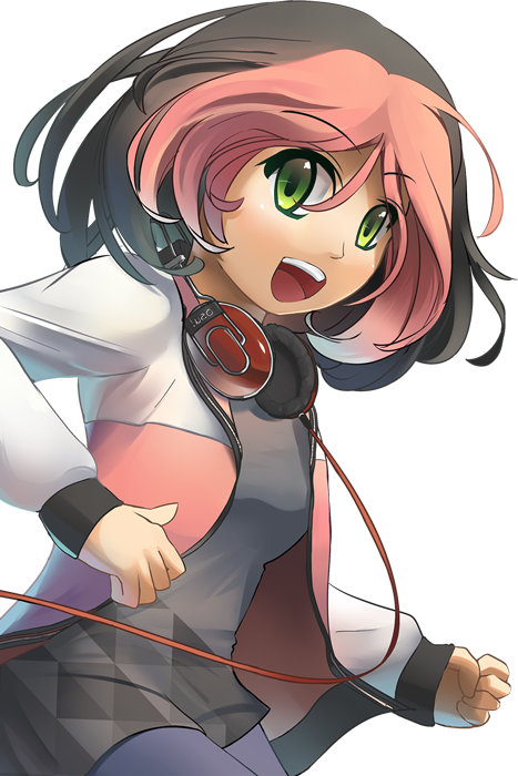
Animation name:
play-skip-{n}.png
This element is used for song selection (the stars that fly from right to left), cursor, kiai time, combobursts.

This element is shown when using mods that disable score submission.

Beatmap skinnable status is suspected to be a bug.
Tinting varies by version.
- pause screen:
- all versions: tinted blue
- exiting breaks:
- v1.0: tinted white
- v2.0+: tinted red
- pause screen:
Beatmap skinnable status is suspected to be a bug.
If skinned, this element overrides
play-warningarrow.png.This element is used in the pause and fail screens.
Not tinted.

Beatmap skinnable status is suspected to be a bug.
If skinned, this element overrides
play-warningarrow.png.Used for the end break warning.
Not tinted.

This element is seen when the player has a low amount of HP, about less than 50%, during a long enough break.

This element is seen when the player has a high amount of HP, about more than 50%, during a long enough break.

This element is used in multi games, seen next to the player’s score (on the sides) when the player votes to skip the intro of a beatmap.

Used when playing with 4:3 storyboards on widescreen.
While beatmapping, disable
Widescreen supportin song setup for this to appear.This element is stretched to fit the needed area.
The right pillar is flipped horizontally.

This element is only used in the beatmap editor.
Should be a circle.

Ranking Panel
Can be animated, but only the zeroth frame will be used.
- Animation name:
ranking-accuracy-{n}.png
- Animation name:
Positioning varies:
- v1.0: (291,500)
- v2.0+: (291,480)

Suggested SD size:
- v1.0: min: 308x156
- v2.0+: min: 308x148
Positioning varies:
- v1.0: (256,576)
- v2.0+: (256,608)
The box itself is 301x141.
The first 7 pixels at the top and at the left should be transparent.
- In v1 it’s shifted down by 8px.
Can be animated, but only the zeroth frame will be used.
- Animation name:
ranking-maxcombo-{n}.png
- Animation name:
Positioning varies:
- v1.0: (8,500)
- v2.0+: (8,480)

Suggested SD size:
- v1.0: max height: 694px
- v2.0+: max height: 666px
Positioning varies:
- v1.0: (0,74)
- v2.0+: (0,102)
Can be animated, but only the zeroth frame will be used.
- Animation name:
ranking-perfect-{n}.png
- Animation name:
Positioning varies:
- v1.0: (320,688)
- v2.0+: (416,688)

x-position 32px away from the right side

Position varies:
- at 672px height.
- at 576px height, if retry is not available.

Positioned at 576px height.
If skinned, this element overrides
pause-retry.png.

This element is used in multi only.
Scorebar
This element has no size restrictions.
When used in osu!mania, this element is rotated 90 degrees anti-clockwise, scaled to 0.7x size, and placed at the bottom right of stage.

Animation name:
scorebar-colour-{n}.png.Blend mode varies:
- Multiplicative, if
scorebar-marker.pngis used.- Tinted black over time when near critical zone and tinted red in the critical zone.
- Multiplicative, if
Normal, otherwise.
Positioning varies:
- If a marker is used, positioned at (12,12).
- Otherwise, positioned at (5,16).
When used in osu!mania, this element is rotated 90 degrees anti-clockwise, scaled to 0.7x size, and placed at the bottom right of stage.

scorebar-marker.pnghas higher priority.This element represents the “passing” zone.
This element is not used in osu!mania.
Y-position at 16; x-position is placed at the end of the cropped
scorebar-colour.pngA
scorebar-colour.pngis required for this element to appear.

scorebar-marker.pnghas higher priority.this element represents the “warning” zone
This element is not used in osu!mania
Y-position at 16; x-position is placed at the end of the cropped
scorebar-colour.pngA
scorebar-colour.pngis required for this element to appear.

scorebar-marker.pnghas higher priority.This element represents the “critical” zone.
This element is not used in osu!mania
Y-position at 16; x-position is placed at the end of the cropped
scorebar-colour.pngA
scorebar-colour.pngis required for this element to appear.

If skinned, this element overrides the
scorebar-ki.png,scorebar-kidanger.png, andscorebar-kidanger2.pngelements.The marker fades out if the player reaches the critical zone.
This element is not used in osu!mania.
Y-position at 16; x-position is placed at the end of the cropped
scorebar-colour.png.

Score Numbers
By default, this is also used for the combo numbers.
Custom pathing possible by using
ScorePrefixComboPrefix(only for combo counters)
Different scaling depending on usage:
- Results screen
- All counters: x1.1
- Total Score: x1.3 in V2+
- In-game
- Score: x0.96
- Accuracy: x0.57
- osu!standard Combo: x1.3 (x1.8 fully expanded)
- Results screen
Blend mode varies:

By default, this is also used for the combo numbers.
Custom pathing possible by using
ScorePrefixComboPrefix(only for combo counters)
Different scaling depending on usage:
- Results screen
- All counters: x1.1
- Total Score: x1.3 in V2+
- In-game
- Score: x0.96
- Accuracy: x0.57
- Results screen
This element is for the accuracy.
The usage is dependent on your selected language.

This element is for the accuracy.
Custom pathing possible by using
ScorePrefixComboPrefix(only for combo counters)
Different scaling depending on usage:
- Results screen
- All counters: x1.1
- In-game
- Accuracy: x0.57
- Results screen

This element is for the combo, only used in osu!.
Custom pathing possible by using
ScorePrefixComboPrefix(only for combo counters)
Different scaling depending on usage:
- Results screen
- All counters: x1.1
- In-game
- osu!standard Combo: x1.3 (x1.8 fully expanded)
- Results screen
Blend mode varies:
- If used for combo counter:
- Additive for the expanding after images.
- If used for combo counter:

Score Numbers (Lazer only)
Lazer only.
This element is used on the “legacy” PP counter component

Song Selection Buttons
Any pixels outside of the 25x25 square will be cut off.

In v1.0, positioning is 87px away from the bottom.
Suggested SD size:
- v1.0: 92x87
- v2.0+: 92x90

Hover over
selection-mode.pngto see.In v1.0, positioning is 87px away from the bottom.
Suggested SD size:
- v1.0: 92x87
- v2.0+: 92x90

In v1.0, positioning is 87px away from the bottom.
Suggested SD size:
- v1.0: 77x87
- v2.0+: 77x87

Hover over
selection-mods.pngto see.In v1.0, positioning is 87px away from the bottom.
Suggested SD size:
- v1.0: 77x87
- v2.0+: 77x87

In v1.0, positioning is 87px away from the bottom.
Suggested SD size:
- v1.0: 77x87
- v2.0+: 77x87

Hover over
selection-random.pngto see.In v1.0, positioning is 87px away from the bottom.
Suggested SD size:
- v1.0: 77x87
- v2.0+: 77x87

In v1.0, positioning is 87px away from the bottom.
Suggested SD size:
- v1.0: 77x87
- v2.0+: 77x87

Hover over
selection-options.pngto see.In v1.0, positioning is 87px away from the bottom.
Suggested SD size:
- v1.0: 77x87
- v2.0+: 77x87

Depending on the client’s window size, 4 to 5 tabs will be displayed.

Song Selection
Stretches to 100% of screen width.
Making this element too tall will prevent mouse clicks from interacting with elements below it.

Rightmost few pixels repeat from a certain point
Repetitions are layered below the initial asset
Their starting point varies depending on user’s in-game resolution

Song Selection Carousel
This element is used for difficulty star ratings (seen in song selection).
- v2.2+ will scale down the last star, if necessary
- v2.1- will crop the last star, if necessary
Tinting depends on the state of
menu-button-background.png

This element is used for song selection (the stars that fly from right to left), cursor, kiai time, combobursts.


