Standard
Hitbursts
Positioned at
X: 384Y: 346onranking-panel.png.- For catch:
- Positioned at
X: 122Y: 352. - Scaled down by a factor of 0.2.
- Positioned at
- For catch:
Animation name:
hit0-{n}.pngAnimation rate is fixed to 60 FPS. With a total length of 1.1s
If animation is used:
- animation does not loop, but the last frame persists until it fades out.
- results screen uses 0th frame
- static sprites are used (if included)
- single frame behaviour is not used.
Animation timing: (frame:opacity)
0-7 : 0% -> 100%
8-30 : 100%
30-66 : 100% -> 0%

Positioned at
X: 64Y: 346onranking-panel.png.Animation name:
hit50-{n}.pngAnimation rate is fixed to 60 FPS. With a total length of 1.1s
If animation is used:
- animation does not loop, but the last frame persists until it fades out.
- results screen uses 0th frame
- static sprites are used (if included)
- single frame behaviour is not used.
Animation timing: (frame:opacity)
0-7 : 0% -> 100%
8-30 : 100%
30-66 : 100% -> 0%

Positioned at
X: 64Y: 250onranking-panel.png.Animation name:
hit100-{n}.pngAnimation rate is fixed to 60 FPS. With a total length of 1.1s
If animation is used:
- animation does not loop, but the last frame persists until it fades out.
- results screen uses 0th frame
- static sprites are used (if included)
- single frame behaviour is not used.
Animation timing: (frame:opacity)
0-7 : 0% -> 100%
8-30 : 100%
30-66 : 100% -> 0%

Positioned at
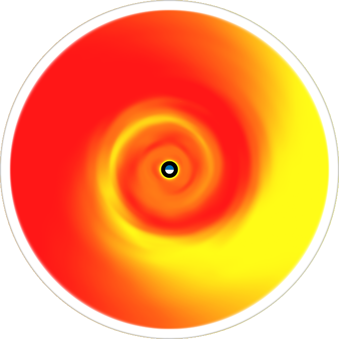
X: 384Y: 250onranking-panel.png.Default skin shows 喝 (Katsu)
- Shows after finishing a combo with a 100
Animation name:
hit100k-{n}.pngAnimation rate is fixed to 60 FPS. With a total length of 1.1s
If animation is used:
- animation does not loop, but the last frame persists until it fades out.
- results screen uses 0th frame
- static sprites are used (if included)
- single frame behaviour is not used.
Animation timing: (frame:opacity)
0-7 : 0% -> 100%
8-30 : 100%
30-66 : 100% -> 0%

Positioned at
X: 64Y: 154onranking-panel.png.Animation name:
hit300-{n}.pngAnimation rate is fixed to 60 FPS. With a total length of 1.1s
If animation is used:
- animation does not loop, but the last frame persists until it fades out.
- results screen uses 0th frame
- static sprites are used (if included)
- single frame behaviour is not used.
Animation timing: (frame:opacity)
0-7 : 0% -> 100%
8-30 : 100%
30-66 : 100% -> 0%

Positioned at
X: 384Y: 154onranking-panel.png.Default skin shows 激 (Geki)
- Shows after finishing a combo with only 300s
Animation name:
hit300g-{n}.pngAnimation rate is fixed to 60 FPS. With a total length of 1.1s
If animation is used:
- animation does not loop, but the last frame persists until it fades out.
- results screen uses 0th frame
- static sprites are used (if included)
- single frame behaviour is not used.
Animation timing: (frame:opacity)
0-7 : 0% -> 100%
8-30 : 100%
30-66 : 100% -> 0%

Default skin shows 喝 (Katsu)
- Shows after finishing a combo with a 300, while having 1 or more 100
Animation name:
hit300k-{n}.pngAnimation rate is fixed to 60 FPS. With a total length of 1.1s
If animation is used:
- animation does not loop, but the last frame persists until it fades out.
- results screen uses 0th frame
- static sprites are used (if included)
- single frame behaviour is not used.
Animation timing: (frame:opacity)
0-7 : 0% -> 100%
8-30 : 100%
30-66 : 100% -> 0%

hit50.pngmust be skinned.

hit100.pngmust be skinned.This element is used for
hit100.pngandhit100k.png.

hit300.pngmust be skinned.This element is used for
hit300,hit300g, andhit300k.

Hitcircle
This element fades in before getting tapped and expands when tapped or missed.
- If Hidden mod is enabled, this will fade in before getting tapped and only fade out.
Tinting depends on the hit circle’s combo colour.
Also used for
sliderstartcircleand/orsliderendcircleif not skinned.Should be a circle.

This element fades in before getting tapped and expands when tapped or missed.
- If Hidden mod is enabled, this will fade in before getting tapped and only fade out.
This can either overlay or underlay the combo number, by default this will always overlay.
- To make this underlay the combo number, set
HitCircleOverlayAboveNumberto0.
- To make this underlay the combo number, set
Should be a circle.
This element was animatable in the past. For full details, see skinning history.
The overlay’s visibility on sliders depends on slider circle elements:
- If
sliderstartcircle/sliderendcircleexists in a skin withoutsliderstartcircleoverlay/sliderendcircleoverlay, thenhitcircleoverlayisn’t displayed at all on slider starts or ends. - If
sliderstartcircle/sliderendcircledoes not exist, thenhitcircleoverlayis used as the overlay sprite for slider starts or ends.
- If
Animation name:
followpoint-{n}.pngIf an arrow-like figure is used, it should point towards the right.
This stays on the screen for 1.2 seconds (1200ms).

This can be disabled in the options.
Tinting depends on the hit circle’s combo colour.
Used during kiai time:
- Coloured afterimage as part of hitburst explosion.
- Glowing behind hit circles during kiai time.
In v2.0+, the expanding animation is smaller.
Overrides
hitcircle.pngfor the start of the slider, if skinned.This element is the hit circle for the start of the slider.
This element fades in before getting tapped and expands when tapped or missed.
- If Hidden mod is enabled, this will fade in before getting tapped and only fade out.
Should be a circle.

This element fades in before getting tapped and expands when tapped or missed.
- If Hidden mod is enabled, this will fade in before getting tapped and only fade out.
This can either overlay or underlay the combo number, by default this will always overlay.
- To make this underlay the combo number, set
HitCircleOverlayAboveNumberto0.
- To make this underlay the combo number, set
Overrides the
hitcircle.pngimage for the start of the slider.sliderstartcircle.pngis required for this to work.Should be a circle.
This element was animatable in the past. For full details, see skinning history.
Overrides
hitcircle.pngfor the end of the slider, if skinned.This element is the hitcircle for the end of the slider.
This element fades in before completing and expands when completed.
- If Hidden mod is enabled, this will fade in before completing and only fade out.
Should be a circle.
This element fades in before completing and expands when completed.
- If Hidden mod is enabled, this will fade in before completing and only fade out.
This can either overlay or underlay the combo number, by default this will always overlay.
- To make this underlay the combo number, set
HitCircleOverlayAboveNumberto0.
- To make this underlay the combo number, set
Overrides the
hitcircleoverlay.pngimage for the end of the slider.sliderendcircle.pngis required for this to work.Should be a circle.
This element was animatable in the past. For full details, see skinning history.
osu! will rotate this element to line up with the slider’s path.
This element will pulse at the bpm.
If an arrow-like figure is used, it should point towards the right.

Hitcircle Numbers
In v1.0, these expanded then fades out with the hit circle.
- If Hidden mod is enabled, this will only fade out.
In v2.0+, these fade out.
Custom pathing possible by using
HitCirclePrefixThis element is downscaled by 0.8x

In v1.0, these expanded then fades out with the hit circle.
- If Hidden mod is enabled, this will only fade out.
In v2.0+, these fade out.
Custom pathing possible by using
HitCirclePrefixThis element is downscaled by 0.8x

In v1.0, these expanded then fades out with the hit circle.
- If Hidden mod is enabled, this will only fade out.
In v2.0+, these fade out.
Custom pathing possible by using
HitCirclePrefixThis element is downscaled by 0.8x

In v1.0, these expanded then fades out with the hit circle.
- If Hidden mod is enabled, this will only fade out.
In v2.0+, these fade out.
Custom pathing possible by using
HitCirclePrefixThis element is downscaled by 0.8x

In v1.0, these expanded then fades out with the hit circle.
- If Hidden mod is enabled, this will only fade out.
In v2.0+, these fade out.
Custom pathing possible by using
HitCirclePrefixThis element is downscaled by 0.8x

In v1.0, these expanded then fades out with the hit circle.
- If Hidden mod is enabled, this will only fade out.
In v2.0+, these fade out.
Custom pathing possible by using
HitCirclePrefixThis element is downscaled by 0.8x

In v1.0, these expanded then fades out with the hit circle.
- If Hidden mod is enabled, this will only fade out.
In v2.0+, these fade out.
Custom pathing possible by using
HitCirclePrefixThis element is downscaled by 0.8x

In v1.0, these expanded then fades out with the hit circle.
- If Hidden mod is enabled, this will only fade out.
In v2.0+, these fade out.
Custom pathing possible by using
HitCirclePrefixThis element is downscaled by 0.8x

In v1.0, these expanded then fades out with the hit circle.
- If Hidden mod is enabled, this will only fade out.
In v2.0+, these fade out.
Custom pathing possible by using
HitCirclePrefixThis element is downscaled by 0.8x

In v1.0, these expanded then fades out with the hit circle.
- If Hidden mod is enabled, this will only fade out.
In v2.0+, these fade out.
Custom pathing possible by using
HitCirclePrefixThis element is downscaled by 0.8x

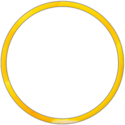
Slider
Animation name:
sliderfollowcircle-{n}.pngMax size: 308x308 (hitbox)
This element expands briefly when collecting a slider tick.
Animation name:
sliderb{n}.png(no hyphen (-))Tinting depends on the hit circle’s combo colour.
By default, the sliderball flips upon hitting the reverse arrow.
- To disable this, set
sliderballflipto0.
- To disable this, set
Ignored if
sliderb.pngis skinned.- Beatmap skinnable if the player skin does not have
sliderb.pngskinned.
- Beatmap skinnable if the player skin does not have
Tinted black.
This element is the background layer of the default slider ball.
Ignored if
sliderb.pngis skinned.- Beatmap skinnable if the player skin does not have
sliderb.pngskinned.
- Beatmap skinnable if the player skin does not have
This element is the top layer of the ball that stays in a static position (does not flip nor rotate).
Beatmap Skinnable if the player skin is using v1.0.
Used when the player collects a slider tick.
Should say “10”.

Beatmap Skinnable if the player skin is using v1.0.
Used when the player starts a slider and/or when they hit the reverse arrow.
Should say “30”.

This element is the slider tick.
If this element is overlapping the slider start or end, it will not be rendered.
This element is also used in osu!taiko.

Spinner
This element is positioned around 397px vertically.
Applied to both styles.
Shrinks over time, like
approachcircle.pngUsage is forced when
spinner-circle.pngorspinner-top.pngis skinned.This element is also used for osu!taiko.
RPM is short for “Revolutions Per Minute”
This element is positioned at 139px to the left from the middle of the screen and at 712px height
X: 373Y: 712at 1024x768X: 544Y: 712at 1366x768

This element is positioned around 230px vertically.
This appears when the player has fulfilled the spinner.

This element is positioned around 582px vertically.
This appears at the start of a spinner.

Spinner (Old)
osu! is watching for this element. If found, it will force the old styled spinners on v2.0+ (all elements in this section).
Using the suggested SD size will help alignment with
spinner-metre.png.By default, tinted grey.
- To change this, use the
SpinnerBackgroundcommand.
- To change this, use the
This element is positioned around 397px vertically.
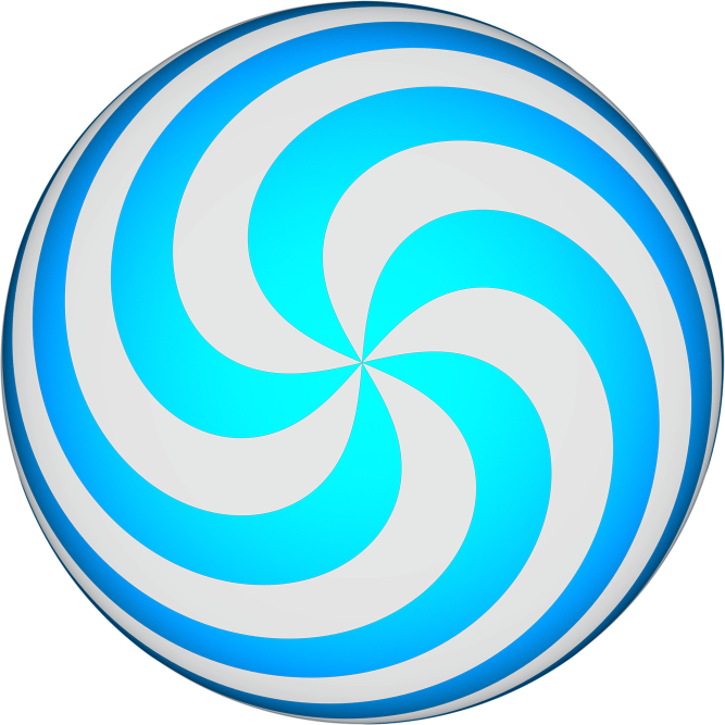
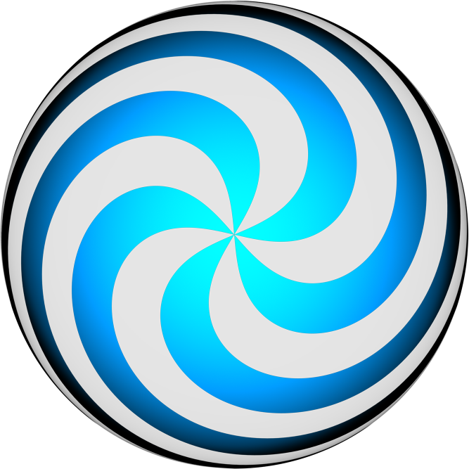
This element is the rotating part of the spinner.
This element is also used for osu!taiko.
- If using the new spinner style, you can still skin this for osu!taiko.
Positioned 46px away from top and 512px to the left from the middle axis.
X: 0Y: 46at 1024x768 andX: 171Y: 46at 1366x768.
This element is the progression bars
The highest part of the bar will blink when bonus points are awarded.
- Blinking can be disabled by setting
SpinnerNoBlinkto1in the skin.ini
- Blinking can be disabled by setting
Beatmap Skinnable if the player skin is using v1.0.
This appears after the spinner fades out.
Spinner (New)
This element is positioned around 397px vertically.
Tinted cyan, blinks white when bonus points are awarded
This blinks when awarding bonus points.
This element is the lowest layer.
This element is positioned around 397px vertically.
This rotates the slowest.
This element is the second lowest layer.
This element is positioned around 397px vertically.
This rotates the second fastest (slower than
spinner-middle2.png).This element is the middle layer.
This element is positioned around 397px vertically.
Tinted red over time (this is the time indicator).
This element is the highest layer.
This element is positioned around 397px vertically.
This rotates the fastest.
This element is the second highest layer.
