Menu Files
Button
Use same height as other button pieces.
Tinting varies by button state.

This element is stretched to fit the needed width.
Use same height as other button pieces.
Tinting varies by button state.

Use same height as other button pieces.
Tinting varies by button state.

Animation name:
menu-back-{n}.png.The native back button is not skinnable.
- If this element is skinned, it will override the new one everywhere, except for the options.

Mod Icons

Click the Auto mod icon to see this icon.


This element is osu!mania-specific.


This element is osu!mania-specific.
Cycle through the xK mods to view.

This element is osu!mania-specific.
Cycle through the xK mods to view.

This element is osu!mania-specific.
Cycle through the xK mods to view.

This element is osu!mania-specific.

This element is osu!mania-specific.
Cycle through the xK mods to view.

This element is osu!mania-specific.
Cycle through the xK mods to view.

This element is osu!mania-specific.
Cycle through the xK mods to view.

This element is osu!mania-specific.
Cycle through the xK mods to view.

This element is osu!mania-specific.
Cycle through the xK mods to view.

This element is osu!mania-specific.

This element is osu!mania-specific.

Click the Double Time mod icon to see this icon.


Click the Sudden Death mod icon to see this icon.

This element is osu!mania-specific.


This element is osu!-specific mod.
This mod will move the cursor for the player while the player just needs to tap or click.


This element is osu!-specific mod.


This mod is available in the cuttingedge stream only.
This element is an osu!-specific mod.

This mod does not have an image in-game.
This mod does not show up in the mod selection or leaderboards.
Indicator for plays with certain mods and combinations.
- Does not show up if only ‘Score V2’, ‘Auto’, ‘Double Time’, ‘Nightcore’, or ‘Half Time’ by itself is used, combinations with other mods including them will show the mod.

This mod does not have an image in-game.
This mod does not show up in the mod selection.
Indicator for plays done using a touchscreen.
- The client uses a background algorithm to calculate if a play is done with a touchscreen, if too many cursor warps occur it might be applied to a play.
Cursor
By default, this element will rotate and expand (on click).
skin.ini commands:
- To disable cursor expand (on click), set
CursorExpandto0. - To disable cursor rotate, set
CursorRotateto0.
- To disable cursor expand (on click), set

This element does not rotate nor expand (on click).
This element is above the
cursor.pngelement.

This element is used when the player presses the smoke key.
- By default, the smoke key is bound to
C.
- By default, the smoke key is bound to

This element is underneath the
cursor.pngelementIf
cursormiddle.pngis present, a longer trail is used.By default, this element does not rotate.
skin.ini command:
- To enable cursortrail rotate, set
CursorTrailRotateto1.
- To enable cursortrail rotate, set

This element is used when the player presses the Left-Click key or Right-Click key on their keyboard or mouse.
- By default, the Left-Click key is bound to
Z. - By default, the Right-Click key is bound to
X.
- By default, the Left-Click key is bound to

Countdown
This should either say “1” or “3”.

This should say “2”.

This should either say “3” or “1”.

This should say “Go!”.

This should say “Are You Ready?” or “Ready?”.

Game Mode Indicators
This element flashes in the centre of the song select screen in respect of the song’s BPM.
Select osu! for this to be visible.

This element flashes in the centre of the song select screen in respect of the song’s BPM.
Select osu!taiko for this to be visible.
This element flashes in the centre of the song select screen in respect of the song’s BPM.
Select osu!catch for this to be visible.

This element flashes in the centre of the song select screen in respect of the song’s BPM.
Select osu!mania for this to be visible.

This element is used inside the game mode selection dropdown menu.
Click on
selection-mode.pngto see.

This element is used inside the game mode selection dropdown menu.
Click on
selection-mode.pngto see.

This element is used inside the game mode selection dropdown menu.
Click on
selection-mode.pngto see.

This element is used inside the game mode selection dropdown menu.
Click on
selection-mode.pngto see.

This element is on top of the
selection-mode.pngelement.Select osu! for this to be visible.
If the
menu-snow.pngelement is not skinned, this element will be used if it is selected.

This element is on top of the
selection-mode.pngelement.Select osu!taiko for this to be visible.
If the
menu-snow.pngelement is not skinned, this element will be used if it is selected.

This element is on top of the
selection-mode.pngelement.Select osu!catch for this to be visible.
If the
menu-snow.pngelement is not skinned, this element will be used if it is selected.

This element is on top of the
selection-mode.pngelement.Select osu!mania for this to be visible.
If the
menu-snow.pngelement is not skinned, this element will be used if it is selected.

Grade Letters
Positioning varies:
- 192px away from right screenborder
- v1.0: at 272px height
- v2.0+: at 320px height

Origin varies:
- Break: Centre
- Song Select panel: Left
- User scores: Centre

Positioning varies:
- 192px away from right screenborder
- v1.0: at 272px height
- v2.0+: at 320px height

Origin varies:
- Break: Centre
- Song Select panel: Left
- User scores: Centre

Positioning varies:
- 192px away from right screen border
- v1.0: at 272px height
- v2.0+: at 320px height

Origin varies:
- Break: Centre
- Song Select panel: Left
- User scores: Centre

Positioning varies:
- 192px away from right screen border
- v1.0: at 272px height
- v2.0+: at 320px height

Origin varies:
- Break: Centre
- Song Select panel: Left
- User scores: Centre

Positioning varies:
- 192px away from right screen border
- v1.0: at 272px height
- v2.0+: at 320px height

Origin varies:
- Break: Centre
- Song Select panel: Left
- User scores: Centre

Positioning varies:
- 192px away from right screen border
- v1.0: at 272px height
- v2.0+: at 320px height

Origin varies:
- Break: Centre
- Song Select panel: Left
- User scores: Centre

Positioning varies:
- 192px away from right screen border
- v1.0: at 272px height
- v2.0+: at 320px height

Origin varies:
- Break: Centre
- Song Select panel: Left
- User scores: Centre

Positioning varies:
- 192px away from right screen border
- v1.0: at 272px height
- v2.0+: at 320px height

Origin varies:
- Break: Centre
- Song Select panel: Left
- User scores: Centre

Key Counter

Positioning varies for each key:
- 24px away from screenborder
- K1/L: at 350px height
- K2/R: at 398px height
- M1/D: at 446px height
- M2: at 492px height
Toggleable in the options.
Shrinks briefly when the keys are pressed.
Tinting varies by button location and state:
- White, if key is not pressed.
- Yellow, if the key is pressed and located on the top half.
- Purple, if the key is pressed and located on the bottom half.

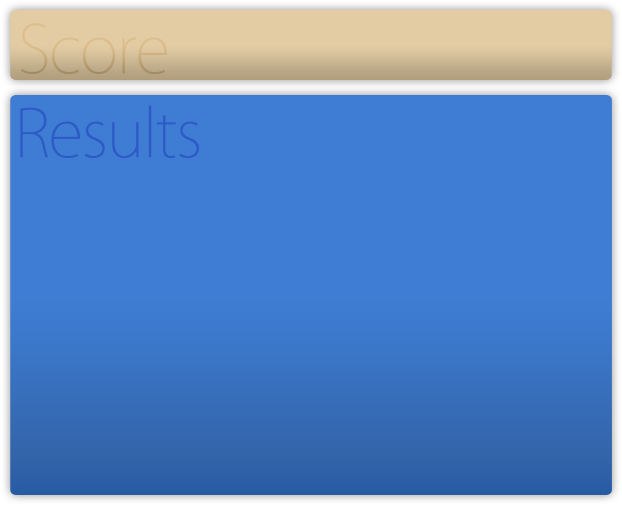
Leaderboard
This element is used for the in-game leaderboards and input overlay.
- For input overlay, the initial button labels are not skinnable.
Tinting depends on use:
- Score: white
- Combo: cyan
- Input overlay: use
InputOverlayTextvalue from skin.ini or black, if not defined
Origin varies on use:
- Score: Top Left
- Combo: Top Right
- Rank: Top Right
- Input overlay: Top

This element is used for the in-game leaderboards.
This element is used as the decimal separator.
- Usage depends on your selected language.
Tinting depends on use:
- Score: white
- Combo: cyan
Origin varies on use:
- Score: Top Left
- Combo: Top Right

This element is used for the in-game leaderboards.
This element is used as the decimal separator.
- Usage depends on your selected language.
Tinted white.

This element is used for the in-game leaderboards.
This element is used in Multi games when the win condition is set to Accuracy.
Tinted white.

This element is used for the in-game leaderboards.
This element is used as the multiplier symbol.
Tinted cyan.

Main Menu
osu!supporter required.
This element is positioned in the centre and is set to cover (fill the entire width and height while keeping its aspect ratio, but crop anything that is outside the game window).
By default, osu! has a set of background images that it will cycle through.
- If this element is skinned and the user has osu!supporter tag, this element will override this behaviour.
This element is used as the playfield if beatmap does not have a background.
The seasonal background option can affect the visibility of this element.
- If it is set to
Alwaysthe seasonal backgrounds will override this element. - If it is set to
Sometimesthe seasonal backgrounds will override this element while they are in active use.
- If it is set to
.jpgextension only.- If the image type is
.pngchange the extension to.jpg. - If the background is transparent, the background colour will be black.
- If the image type is
The player can drag and drop an image to overwrite the skin’s skinned image. This will replace the image in the skin’s folder!

osu!supporter required.
This element appears upon starting the client.
This element folds out and expands, then fades out.

If not skinned, the current game mode’s small icon will be used instead.
Must be enabled in the options to see.
- This option may forcibly be enabled during the holidays (Christmas).
Used in the offset wizard.
Stretched to fit screen height.
Tinting varies by tick state.

Pause Screen
When the game is paused, the playfield will be dimmed and this file will overlay on top of it.
This element will not stretch to fit.
Full image height is 768px.
Smaller images are shown with transparent borders while larger images are partially shown.
This can also be a
.jpgfile (and can have the.jpgextension).- osu! prefers
.pngover.jpg.
- osu! prefers
When the player has failed, the playfield will be dimmed and this file will overlay on top of it.
This element will stretch to fit.
This can also be a
.jpgfile (and can have the.jpgextension).- osu! prefers
.pngover.jpg.
- osu! prefers
This element is positioned at 576px height.
This element is seen in the fail and pause screens.

This element is positioned at 224px height.
This element is seen in the pause screen.

This element appears on the ranking screen (after finishing a map or viewing a score).
This element is positioned at 672px height or at 576px height, if
pause-retry.pngis not available.

Positioning varies:
- pause or fail screen:
- Centre, positioned at 400px height
- ranking screen:
- Right, positioned at 576px height
- pause or fail screen:
This element appears on the ranking screen after finishing a map and on the pause and fail screens.

Playfield
To have multiple combobursts, use:
comboburst-{n}.png.- One of the images in the set will be appear when a combo milestone is met.
For v2.2-, this is osu! and osu!catch’s combobursts.
For v2.3+, this is osu!’s combobursts.
This can be disabled in the options.
This should face towards the right.

Animation name:
play-skip-{n}.png

This element is used for song selection (the stars that fly from right to left), cursor, kiai time, combobursts.

Skin versions 2.2+ can support thumbnails (must be enabled in the options) for song selection
- Thumbnails get positioned 9px away from the left image border
- Thumbnail size is 115x85
This element is used in various places:
- scoreboards in song selection
- button for the beatmap difficulty in song selection
- scoreboards on the left while playing
- button that shows the selected beatmap while waiting in a room in multiplayer
Tinting varies by button state.

This element is shown when using mods that disable score submission.

Beatmap skinnable status is suspected to be a bug.
Tinting varies by version.
- pause screen:
- all versions: tinted blue
- exiting breaks:
- v1.0: tinted white
- v2.0+: tinted red
- pause screen:
Beatmap skinnable status is suspected to be a bug.
If skinned, this element overrides
play-warningarrow.png.This element is used in the pause and fail screens.
Not tinted.
Beatmap skinnable status is suspected to be a bug.
If skinned, this element overrides
play-warningarrow.png.Used for the end break warning.
Not tinted.
This element is seen when the player has a low amount of HP, about less than 50%, during a long enough break.
This element is seen when the player has a high amount of HP, about more than 50%, during a long enough break.

This element is used in multi games, seen next to the player’s score (on the sides) when the player votes to skip the intro of a beatmap.

Used when playing with 4:3 storyboards on widescreen.
While beatmapping, disable
Widescreen supportin song setup for this to appear.This element is stretched to fit the needed area.
The right pillar is flipped horizontally.

This element is only used in the beatmap editor.
Should be a circle.

Ranking Panel
Can be animated, but only the zeroth frame will be used.
- Animation name:
ranking-accuracy-{n}.png
- Animation name:
Positioning varies:
- v1.0:
X: 291Y: 500 - v2.0+:
X: 291Y: 480
- v1.0:

Suggested SD size:
- v1.0: min: 308x156
- v2.0+: min: 308x148
Positioning varies:
- v1.0:
X: 256Y: 576 - v2.0+:
X: 256Y: 608
- v1.0:
The box itself is 301x141.
The first 7 pixels at the top and at the left should be transparent.
- In v1 it’s shifted down by 8px.
Can be animated, but only the zeroth frame will be used.
- Animation name:
ranking-maxcombo-{n}.png
- Animation name:
Positioning varies:
- v1.0:
X: 8Y: 500 - v2.0+:
X: 8Y: 480
- v1.0:

Suggested SD size:
- v1.0: max height: 694px
- v2.0+: max height: 666px
Positioning varies:
- v1.0:
X: 0Y: 74 - v2.0+:
X: 0Y: 102
- v1.0:
Can be animated, but only the zeroth frame will be used.
- Animation name:
ranking-perfect-{n}.png
- Animation name:
Positioning varies:
- v1.0:
X: 320Y: 688 - v2.0+:
X: 416Y: 688
- v1.0:

x-position 32px away from the right side

Position varies:
- at 672px height.
- at 576px height, if retry is not available.

Positioned at 576px height.
If skinned, this element overrides
pause-retry.png.
This element is used in multi only.

Scorebar
This element has no size restrictions.
When used in osu!mania, this element is rotated 90 degrees anti-clockwise, scaled to 0.7x size, and placed at the bottom right of stage.

Animation name:
scorebar-colour-{n}.png.Blend mode varies:
- Multiplicative, if
scorebar-marker.pngis used.- Tinted black over time when near critical zone and tinted red in the critical zone.
- Multiplicative, if
Normal, otherwise.
Positioning varies:
- If a marker is used, positioned at
X: 12Y: 12. - Otherwise, positioned at
X: 5Y: 16.
- If a marker is used, positioned at
When used in osu!mania, this element is rotated 90 degrees anti-clockwise, scaled to 0.7x size, and placed at the bottom right of stage.

scorebar-marker.pnghas higher priority.This element represents the “passing” zone.
This element is not used in osu!mania.
Y-position at 16; x-position is placed at the end of the cropped
scorebar-colour.pngA
scorebar-colour.pngis required for this element to appear.
scorebar-marker.pnghas higher priority.this element represents the “warning” zone
This element is not used in osu!mania
Y-position at 16; x-position is placed at the end of the cropped
scorebar-colour.pngA
scorebar-colour.pngis required for this element to appear.
scorebar-marker.pnghas higher priority.This element represents the “critical” zone.
This element is not used in osu!mania
Y-position at 16; x-position is placed at the end of the cropped
scorebar-colour.pngA
scorebar-colour.pngis required for this element to appear.
If skinned, this element overrides the
scorebar-ki.png,scorebar-kidanger.png, andscorebar-kidanger2.pngelements.The marker fades out if the player reaches the critical zone.
This element is not used in osu!mania.
Y-position at 16; x-position is placed at the end of the cropped
scorebar-colour.png.

Score Numbers
By default, this is also used for the combo numbers.
Custom pathing possible by using
ScorePrefixComboPrefix(only for combo counters)
Different scaling depending on usage:
- Results screen
- All counters: x1.1
- Total Score: x1.3 in V2+
- In-game
- Score: x0.96
- Accuracy: x0.57
- osu!standard Combo: x1.3 (x1.8 fully expanded)
- Results screen
Blend mode varies:

By default, this is also used for the combo numbers.
Custom pathing possible by using
ScorePrefixComboPrefix(only for combo counters)
Different scaling depending on usage:
- Results screen
- All counters: x1.1
- Total Score: x1.3 in V2+
- In-game
- Score: x0.96
- Accuracy: x0.57
- Results screen
This element is for the accuracy.
The usage is dependent on your selected language.

This element is for the accuracy.
Custom pathing possible by using
ScorePrefixComboPrefix(only for combo counters)
Different scaling depending on usage:
- Results screen
- All counters: x1.1
- In-game
- Accuracy: x0.57
- Results screen

This element is for the combo, only used in osu!.
Custom pathing possible by using
ScorePrefixComboPrefix(only for combo counters)
Different scaling depending on usage:
- Results screen
- All counters: x1.1
- In-game
- osu!standard Combo: x1.3 (x1.8 fully expanded)
- Results screen
Blend mode varies:
- If used for combo counter:
- Additive for the expanding after images.
- If used for combo counter:

Song Selection Buttons
Any pixels outside of the 25x25 square will be cut off.
v1.0:- Origin:
Top Left - Suggested SD Size:
92x87- Positioned 87px away from the bottom
- Origin:
v2.0+:- Origin:
Bottom Left - Suggested SD Size:
92x90
- Origin:

Hover over
selection-mode.pngto see.v1.0:- Origin:
Top Left - Suggested SD Size:
92x87- Positioned 87px away from the bottom
- Origin:
v2.0+:- Origin:
Bottom Left - Suggested SD Size:
92x90
- Origin:

v1.0:- Origin:
Top Left - Suggested SD Size:
92x87- Positioned 87px away from the bottom
- Origin:
v2.0+:- Origin:
Bottom Left - Suggested SD Size:
92x90
- Origin:

Hover over
selection-mods.pngto see.v1.0:- Origin:
Top Left - Suggested SD Size:
92x87- Positioned 87px away from the bottom
- Origin:
v2.0+:- Origin:
Bottom Left - Suggested SD Size:
92x90
- Origin:

v1.0:- Origin:
Top Left - Suggested SD Size:
92x87- Positioned 87px away from the bottom
- Origin:
v2.0+:- Origin:
Bottom Left - Suggested SD Size:
92x90
- Origin:

Hover over
selection-random.pngto see.v1.0:- Origin:
Top Left - Suggested SD Size:
92x87- Positioned 87px away from the bottom
- Origin:
v2.0+:- Origin:
Bottom Left - Suggested SD Size:
92x90
- Origin:

v1.0:- Origin:
Top Left - Suggested SD Size:
92x87- Positioned 87px away from the bottom
- Origin:
v2.0+:- Origin:
Bottom Left - Suggested SD Size:
92x90
- Origin:

Hover over
selection-options.pngto see.v1.0:- Origin:
Top Left - Suggested SD Size:
92x87- Positioned 87px away from the bottom
- Origin:
v2.0+:- Origin:
Bottom Left - Suggested SD Size:
92x90
- Origin:

Depending on the client’s window size, 4 to 5 tabs will be displayed.

Song Selection
Stretches to 100% of screen width.
Making this element too tall will prevent mouse clicks from interacting with elements below it.

Rightmost few pixels repeat from a certain point
Repetitions are layered below the initial asset
Their starting point varies depending on user’s in-game resolution

Song Selection Carousel
Skin versions 2.2+ can support thumbnails (must be enabled in the options) for song selection
- Thumbnails get positioned 9px away from the left image border
- Thumbnail size is 115x85
This element is used in various places:
- scoreboards in song selection
- button for the beatmap difficulty in song selection
- scoreboards on the left while playing
- button that shows the selected beatmap while waiting in a room in multiplayer
Tinting varies by button state.
This element is used for difficulty star ratings (seen in song selection).
- v2.2+ will scale down the last star, if necessary
- v2.1- will crop the last star, if necessary
Tinting depends on the state of
menu-button-background.png

This element is used for song selection (the stars that fly from right to left), cursor, kiai time, combobursts.
Standard
Hitbursts
Positioned at
X: 384Y: 346onranking-panel.png.- For catch:
- Positioned at
X: 122Y: 352. - Scaled down by a factor of 0.2.
- Positioned at
- For catch:
Animation name:
hit0-{n}.pngAnimation rate is fixed to 60 FPS. With a total length of 1.1s
If animation is used:
- animation does not loop, but the last frame persists until it fades out.
- results screen uses 0th frame
- static sprites are used (if included)
- single frame behaviour is not used.
Animation timing: (frame:opacity)
0-7 : 0% -> 100%
8-30 : 100%
30-66 : 100% -> 0%

Positioned at
X: 64Y: 346onranking-panel.png.Animation name:
hit50-{n}.pngAnimation rate is fixed to 60 FPS. With a total length of 1.1s
If animation is used:
- animation does not loop, but the last frame persists until it fades out.
- results screen uses 0th frame
- static sprites are used (if included)
- single frame behaviour is not used.
Animation timing: (frame:opacity)
0-7 : 0% -> 100%
8-30 : 100%
30-66 : 100% -> 0%

Positioned at
X: 64Y: 250onranking-panel.png.Animation name:
hit100-{n}.pngAnimation rate is fixed to 60 FPS. With a total length of 1.1s
If animation is used:
- animation does not loop, but the last frame persists until it fades out.
- results screen uses 0th frame
- static sprites are used (if included)
- single frame behaviour is not used.
Animation timing: (frame:opacity)
0-7 : 0% -> 100%
8-30 : 100%
30-66 : 100% -> 0%

Positioned at
X: 384Y: 250onranking-panel.png.Default skin shows 喝 (Katsu)
- Shows after finishing a combo with a 100
Animation name:
hit100k-{n}.pngAnimation rate is fixed to 60 FPS. With a total length of 1.1s
If animation is used:
- animation does not loop, but the last frame persists until it fades out.
- results screen uses 0th frame
- static sprites are used (if included)
- single frame behaviour is not used.
Animation timing: (frame:opacity)
0-7 : 0% -> 100%
8-30 : 100%
30-66 : 100% -> 0%

Positioned at
X: 64Y: 154onranking-panel.png.Animation name:
hit300-{n}.pngAnimation rate is fixed to 60 FPS. With a total length of 1.1s
If animation is used:
- animation does not loop, but the last frame persists until it fades out.
- results screen uses 0th frame
- static sprites are used (if included)
- single frame behaviour is not used.
Animation timing: (frame:opacity)
0-7 : 0% -> 100%
8-30 : 100%
30-66 : 100% -> 0%

Positioned at
X: 384Y: 154onranking-panel.png.Default skin shows 激 (Geki)
- Shows after finishing a combo with only 300s
Animation name:
hit300g-{n}.pngAnimation rate is fixed to 60 FPS. With a total length of 1.1s
If animation is used:
- animation does not loop, but the last frame persists until it fades out.
- results screen uses 0th frame
- static sprites are used (if included)
- single frame behaviour is not used.
Animation timing: (frame:opacity)
0-7 : 0% -> 100%
8-30 : 100%
30-66 : 100% -> 0%

Default skin shows 喝 (Katsu)
- Shows after finishing a combo with a 300, while having 1 or more 100
Animation name:
hit300k-{n}.pngAnimation rate is fixed to 60 FPS. With a total length of 1.1s
If animation is used:
- animation does not loop, but the last frame persists until it fades out.
- results screen uses 0th frame
- static sprites are used (if included)
- single frame behaviour is not used.
Animation timing: (frame:opacity)
0-7 : 0% -> 100%
8-30 : 100%
30-66 : 100% -> 0%

hit50.pngmust be skinned.

hit100.pngmust be skinned.This element is used for
hit100.pngandhit100k.png.

hit300.pngmust be skinned.This element is used for
hit300,hit300g, andhit300k.

Hitcircle
This element fades in before getting tapped and expands when tapped or missed.
- If Hidden mod is enabled, this will fade in before getting tapped and only fade out.
Tinting depends on the hit circle’s combo colour.
Also used for
sliderstartcircleand/orsliderendcircleif not skinned.Should be a circle.

This element fades in before getting tapped and expands when tapped or missed.
- If Hidden mod is enabled, this will fade in before getting tapped and only fade out.
This can either overlay or underlay the combo number, by default this will always overlay.
- To make this underlay the combo number, set
HitCircleOverlayAboveNumberto0.
- To make this underlay the combo number, set
Should be a circle.
This element was animatable in the past. For full details, see skinning history.
The overlay’s visibility on sliders depends on slider circle elements:
- If
sliderstartcircle/sliderendcircleexists in a skin withoutsliderstartcircleoverlay/sliderendcircleoverlay, thenhitcircleoverlayisn’t displayed at all on slider starts or ends. - If
sliderstartcircle/sliderendcircledoes not exist, thenhitcircleoverlayis used as the overlay sprite for slider starts or ends.
- If
Animation name:
followpoint-{n}.pngIf an arrow-like figure is used, it should point towards the right.
This stays on the screen for 1.2 seconds (1200ms).

This can be disabled in the options.
Tinting depends on the hit circle’s combo colour.
Used during kiai time:
- Coloured afterimage as part of hitburst explosion.
- Glowing behind hit circles during kiai time.
In v2.0+, the expanding animation is smaller.

Overrides
hitcircle.pngfor the start of the slider, if skinned.This element is the hit circle for the start of the slider.
This element fades in before getting tapped and expands when tapped or missed.
- If Hidden mod is enabled, this will fade in before getting tapped and only fade out.
Should be a circle.
This element fades in before getting tapped and expands when tapped or missed.
- If Hidden mod is enabled, this will fade in before getting tapped and only fade out.
This can either overlay or underlay the combo number, by default this will always overlay.
- To make this underlay the combo number, set
HitCircleOverlayAboveNumberto0.
- To make this underlay the combo number, set
Overrides the
hitcircle.pngimage for the start of the slider.sliderstartcircle.pngis required for this to work.Should be a circle.
This element was animatable in the past. For full details, see skinning history.
Overrides
hitcircle.pngfor the end of the slider, if skinned.This element is the hitcircle for the end of the slider.
This element fades in before completing and expands when completed.
- If Hidden mod is enabled, this will fade in before completing and only fade out.
Should be a circle.
This element fades in before completing and expands when completed.
- If Hidden mod is enabled, this will fade in before completing and only fade out.
This can either overlay or underlay the combo number, by default this will always overlay.
- To make this underlay the combo number, set
HitCircleOverlayAboveNumberto0.
- To make this underlay the combo number, set
Overrides the
hitcircleoverlay.pngimage for the end of the slider.sliderendcircle.pngis required for this to work.Should be a circle.
This element was animatable in the past. For full details, see skinning history.
osu! will rotate this element to line up with the slider’s path.
This element will pulse at the bpm.
If an arrow-like figure is used, it should point towards the right.

Hitcircle Numbers
In v1.0, these expanded then fades out with the hit circle.
- If Hidden mod is enabled, this will only fade out.
In v2.0+, these fade out.
Custom pathing possible by using
HitCirclePrefixThis element is downscaled by 0.8x

In v1.0, these expanded then fades out with the hit circle.
- If Hidden mod is enabled, this will only fade out.
In v2.0+, these fade out.
Custom pathing possible by using
HitCirclePrefixThis element is downscaled by 0.8x

In v1.0, these expanded then fades out with the hit circle.
- If Hidden mod is enabled, this will only fade out.
In v2.0+, these fade out.
Custom pathing possible by using
HitCirclePrefixThis element is downscaled by 0.8x

In v1.0, these expanded then fades out with the hit circle.
- If Hidden mod is enabled, this will only fade out.
In v2.0+, these fade out.
Custom pathing possible by using
HitCirclePrefixThis element is downscaled by 0.8x

In v1.0, these expanded then fades out with the hit circle.
- If Hidden mod is enabled, this will only fade out.
In v2.0+, these fade out.
Custom pathing possible by using
HitCirclePrefixThis element is downscaled by 0.8x

In v1.0, these expanded then fades out with the hit circle.
- If Hidden mod is enabled, this will only fade out.
In v2.0+, these fade out.
Custom pathing possible by using
HitCirclePrefixThis element is downscaled by 0.8x

In v1.0, these expanded then fades out with the hit circle.
- If Hidden mod is enabled, this will only fade out.
In v2.0+, these fade out.
Custom pathing possible by using
HitCirclePrefixThis element is downscaled by 0.8x

In v1.0, these expanded then fades out with the hit circle.
- If Hidden mod is enabled, this will only fade out.
In v2.0+, these fade out.
Custom pathing possible by using
HitCirclePrefixThis element is downscaled by 0.8x

In v1.0, these expanded then fades out with the hit circle.
- If Hidden mod is enabled, this will only fade out.
In v2.0+, these fade out.
Custom pathing possible by using
HitCirclePrefixThis element is downscaled by 0.8x

In v1.0, these expanded then fades out with the hit circle.
- If Hidden mod is enabled, this will only fade out.
In v2.0+, these fade out.
Custom pathing possible by using
HitCirclePrefixThis element is downscaled by 0.8x

Slider
Animation name:
sliderfollowcircle-{n}.pngMax size: 308x308 (hitbox)
This element expands briefly when collecting a slider tick.
Animation name:
sliderb{n}.png(no hyphen (-))Tinting depends on the hit circle’s combo colour.
By default, the sliderball flips upon hitting the reverse arrow.
- To disable this, set
sliderballflipto0.
- To disable this, set

Ignored if
sliderb.pngis skinned.- Beatmap skinnable if the player skin does not have
sliderb.pngskinned.
- Beatmap skinnable if the player skin does not have
Tinted black.
This element is the background layer of the default slider ball.
Ignored if
sliderb.pngis skinned.- Beatmap skinnable if the player skin does not have
sliderb.pngskinned.
- Beatmap skinnable if the player skin does not have
This element is the top layer of the ball that stays in a static position (does not flip nor rotate).
Beatmap Skinnable if the player skin is using v1.0.
Used when the player collects a slider tick.
Should say “10”.

Beatmap Skinnable if the player skin is using v1.0.
Used when the player starts a slider and/or when they hit the reverse arrow.
Should say “30”.

This element is the slider tick.
If this element is overlapping the slider start or end, it will not be rendered.
This element is also used in osu!taiko.

Spinner
This element is positioned around 397px vertically.
Applied to both styles.
Shrinks over time, like
approachcircle.pngUsage is forced when
spinner-circle.pngorspinner-top.pngis skinned.This element is also used for osu!taiko.
RPM is short for “Revolutions Per Minute”
This element is positioned at 139px to the left from the middle of the screen and at 712px height
X: 373Y: 712at 1024x768X: 544Y: 712at 1366x768

This element is positioned around 230px vertically.
This appears when the player has fulfilled the spinner.

This element is positioned around 582px vertically.
This appears at the start of a spinner.

Spinner (Old)
osu! is watching for this element. If found, it will force the old styled spinners on v2.0+ (all elements in this section).
Using the suggested SD size will help alignment with
spinner-metre.png.By default, tinted grey.
- To change this, use the
SpinnerBackgroundcommand.
- To change this, use the
This element is positioned around 397px vertically.
This element is the rotating part of the spinner.
This element is also used for osu!taiko.
- If using the new spinner style, you can still skin this for osu!taiko.
Positioned 46px away from top and 512px to the left from the middle axis.
X: 0Y: 46at 1024x768 andX: 171Y: 46at 1366x768.
This element is the progression bars
The highest part of the bar will blink when bonus points are awarded.
- Blinking can be disabled by setting
SpinnerNoBlinkto1in the skin.ini
- Blinking can be disabled by setting
Beatmap Skinnable if the player skin is using v1.0.
This appears after the spinner fades out.
Spinner (New)
This element is positioned around 397px vertically.
Tinted cyan, blinks white when bonus points are awarded
This blinks when awarding bonus points.
This element is the lowest layer.

This element is positioned around 397px vertically.
This rotates the slowest.
This element is the second lowest layer.

This element is positioned around 397px vertically.
This rotates the second fastest (slower than
spinner-middle2.png).This element is the middle layer.
This element is positioned around 397px vertically.
Tinted red over time (this is the time indicator).
This element is the highest layer.
This element is positioned around 397px vertically.
This rotates the fastest.
This element is the second highest layer.

Catch the Beat
Catcher & Interface
Animation name:
fruit-catcher-idle-{n}.pngThis element is the catcher state when doing nothing or catching objects
This should face towards the right.
The first 16 pixels at the top should be transparent.
The width should cover two fruits at a Circle Size of 0.
Animation name:
fruit-catcher-fail-{n}.pngThis element is the “missed” catcher state.
This overrides
fruit-catcher-kiai.pngif a fruit or drop/droplet is missed during kiai time.This should face towards the right.
Animation name:
fruit-catcher-kiai-{n}.pngThis element is the catcher state during kiai time.
fruit-catcher-fail.pngwill override this if a fruit or drop/droplet is missed during kiai time.This should face towards the right.
Beatmap Skinnable if the player skin is using v2.2-.
Animation name:
fruit-ryuuta-{n}.pngThis should face towards the right.
To have multiple combobursts, use:
comboburst-fruits-{n}.png.- One of the images in the set will be appear when a combo milestone is met.
On v2.2-,
comboburst.pngwill be used instead.osu!catch-specific combobursts
This can be disabled in the options.
This should face towards the right.
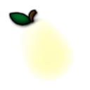
Fruits
This element is shown first.
This element is used for the hyperdash outline.
Tinting depends on the fruit’s combo colour.
This element is shown first; overlaying
fruit-pear.png.
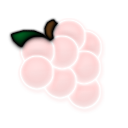
This element is shown second.
This element is used for the hyperdash outline.
Tinting depends on the fruit’s combo colour.
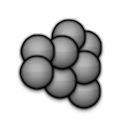
This element is shown second; overlaying
fruit-grapes.png.
This element is shown third.
This element is used for the hyperdash outline.
Tinting depends on the fruit’s combo colour.
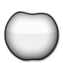
This element is shown third; overlaying
fruit-apple.png.
Positioned at
X: 64Y: 154onranking-panel.png.Also positioned at
X: 384Y: 154onranking-panel.png.- Rotated 45°.
- Scaled down by a factor of 0.85.
- Untinted.
Can be animated, but only the zeroth frame will be used.
- Animation name:
fruit-orange-{n}.png
- Animation name:
This element is shown fourth (last).
This element is used for the hyperdash outline.
Tinting depends on the fruit’s combo colour.
- On the ranking screen:
- Tinted orange (
#ffa500) for collected fruit - Tinted light gray (
#d3d3d3) for missed fruit.
- Tinted orange (
- On the ranking screen:
Positioned at
X: 64Y: 154onranking-panel.png.Also positioned at
X: 384Y: 154onranking-panel.png.- Rotated 45°.
- Scaled down by a factor of 0.85.
Can be animated, but only the zeroth frame will be used.
- Animation name:
fruit-orange-overlay-{n}.png
- Animation name:
This element is shown fourth (last); overlaying
fruit-orange.png.
Tinted yellow.
This element is shown during a “spinner”.
This element is used for the hyperdash outline.
This element is shown during a spinner; overlaying
fruit-bananas.png.

Positioned at
X: 64Y: 250onranking-panel.png.Also positioned at
X: 64Y: 346onranking-panel.png.- Rotated 185°.
- Scaled down by a factor of 0.85.
Can be animated, but only the zeroth frame will be used.
- Animation name:
fruit-drop-{n}.png
- Animation name:
This element is shown during a “slider”.
Tinting depends on the drop’s combo colour.
- On the ranking screen:
- Tinted green (
#9acd32) for collected drops - Tinted light blue (
#add8e6) for missed drops.
- Tinted green (
- On the ranking screen:
This element is not used in the ranking screen.
This element is shown during a “slider”; overlaying
fruit-drop.png
Taiko
Drum Bar
Beatmap skinnable status is suspected to be a bug.
Positioned at
X: 0Y: 216.This element is where the drum goes.
Beatmap skinnable status is suspected to be a bug.
Position varies by skin version:
- v1–v2.0:
X: 29Y: 266(andX: 86Y: 266when mirrored) - v2.1+:
X: 0Y: 216(andX: 90Y: 216when mirrored)
- v1–v2.0:

Beatmap skinnable status is suspected to be a bug.
Position varies by skin version:
- v1–v2.0:
X: 29Y: 266(andX: 86Y: 266when mirrored) - v2.1+:
X: 0Y: 216(andX: 90Y: 216when mirrored)
- v1–v2.0:
Suggested SD size:
- v1.0–v2.0: Max width: 56px
- v2.1+: 90x200
Beatmap skinnable status is suspected to be a bug.
Position varies by skin version:
- v1–v2.0:
X: 85Y: 253(X: 13Y: 253when mirrored) - v2.1+:
X: 90Y: 216(andX: 0Y: 216when mirrored)
- v1–v2.0:
Suggested SD size:
- v1.0–v2.0: Max width: 72px
- v2.1+: 90x200

Beatmap skinnable status is suspected to be a bug.
This element will get stretched to fit screen width.
This element is the normal state of the scrolling bar.
Position varies by skin version:
- v1.0–v2.0:
X: 181Y: 216 - v2.1+:
X: 0Y: 216
- v1.0–v2.0:
Suggested SD size:
- v1.0–v2.0: 843x200
- v2.1+: 1024x200

Beatmap skinnable status is suspected to be a bug.
This element will get stretched to fit screen width.
This element is the kiai state of the scrolling bar.
This element overlays
taiko-bar-right.Position varies by skin version:
- v1.0–v2.0:
X: 181Y: 216 - v2.1+:
X: 0Y: 216
- v1.0–v2.0:
Suggested SD size:
- v1.0–v2.0: 843x200
- v2.1+: 1024x200

This image is displayed on the playfield at the start of each measure in the song (unless omitted by a timing point).

Drumroll
The SD image width must be exactly 1px wide.
This element is the track of the roll where the
sliderscorepoint.pngare placed on.Tinting shifts from yellow to red.

This element is the end part of a roll.
Tinting shifts from yellow to red.

This element is also used in osu!.
This are the ticks of the roll.
Hitbursts
Positioned at
X: 64Y: 346onranking-panel.png.Default skin shows 不可 (Bad)
Animation name:
taiko-hit0-{n}.png.If animated, default effect from static images will not be disabled.

Positioned at
X: 64Y: 250onranking-panel.png.Default skin shows 可 (OK)
Animation name:
taiko-hit100-{n}.png.If animated, default effect from static images will not be disabled.

Positioned at
X: 384Y: 250onranking-panel.png.Default skin shows 良 (Good)
Animation name:
taiko-hit100k-{n}.png.If animated, default effect from static images will not be disabled.

Positioned at
X: 64Y: 154onranking-panel.png.Animation name:
taiko-hit300-{n}.png.If animated, default effect from static images will not be disabled.

Animation name:
taiko-hit300k-{n}.png.If animated, default effect from static images will not be disabled.

Positioned at
X: 384Y: 154onranking-panel.png.Can be animated, but only the zeroth frame will be used.
Animation name:
taiko-hit300g-{n}.pngThis image is only used on the ranking screen (instead of
taiko-hit300k.png).

Notes
This element is used for finisher/big notes.
- This element is upscaled automatically.
This element is also used on the hit position.
Tinted red for “Don” (235,69,44)
Tinted blue for “Katsu” (68,141,171)
Tinted yellow for drumroll starting circle (252,83,6)

Animation name:
taikobigcircleoverlay-{n}.png.- 2 frames only (
0and1) - animation speed depends on BPM
- animation starts at combo 50
- speeds up at combo 150
- 2 frames only (
This element is upscaled automatically.

Tinted red for “Don” (235,69,44)
Tinted blue for “Katsu” (68,141,171)
Tinted yellow for drumroll starting circle (252,83,6)

Animation name:
taikohitcircleoverlay-{n}.png.- 2 frames only (
0and1) - animation speed depends on BPM
- animation starts at 50 combo
- speeds up at 150 combo
- 2 frames only (

This element is used on the hit position as a border.
This element is also used in osu!.
Beatmap skinnable status is suspected to be a bug.
Tinted yellow.
This element is behind the hit position during kiai time, expands when notes are hit.
Tinted orange-red.
There isn’t a need to skin this element for osu!taiko.
- This element is only visible when using a transparent taiko bar.
This pulsates behind the scrolling bar on the hit position during kiai time.
Pippidon
Animation name:
pippidonclear{n}.png.- You can only skin up 7 frames (from 0 to 6).
- If animated, it is recommended to animate all 7 frames. (If not, the last frame will persist for the missing frames in the frame order as stated below.)
- The animation frame order is
0 1 2 3 4 5 6 5 6 5 4 3 2 1 0.
The animation rate is BPM dependent.
This animation only plays once when the player hits a combo milestone; then goes back to the idle or kiai state.

Animation name:
pippidonfail{n}.png.The animation rate is BPM dependent.
This animation plays when the player misses a note or does not have enough health during a break.
This overrides
pippidonkiaiif the player misses a note during kiai time.
Animation name:
pippidonidle{n}.png.The animation rate is BPM dependent.
This animation plays when doing nothing (during breaks or waiting for the player to hit the next note)

Animation name:
pippidonkiai{n}.png.The animation rate is BPM dependent.
This animation plays during kiai time.
pippidonfail.pngoverrides this if the player misses a note during kiai time.

Slider Bar
These are like combobursts.
To have multiple combobursts, use:
taiko-flower-group-{n}.png.- One of the images in the set will be appear when a combo milestone is met.
This image expands and fades in from behind pippidon when it changes to clear state.
Beatmap skinnable status is suspected to be a bug.
This scrolls in a seamless loop, from the right side towards the left.
This element is disabled if the beatmap has a storyboard.
Gets upscaled by 1.4x in-game.
This appears when the player misses a note or if the health bar isn’t filled up to 50% during a break.
Beatmap skinnable status is suspected to be a bug.
This scrolls in a seamless loop, from the right side towards the left.
This element is disabled if the beatmap has a storyboard.
Gets upscaled by 1.4x in-game.
Spinner
This element is an indicator for the spinner.
Beatmap skinnable status is suspected to be a bug.
This element is also used in osu!.
For each hit in the spinner happens, the circle rotates anti-clockwise.
Beatmap skinnable status is suspected to be a bug.
This element is also used in osu!.
This element is the duration indicator of the spinner.
- This shrinks over time.
Mania
Hitbursts
Positioned at
X: 384Y: 346onranking-panel.png.Animation name:
mania-hit0-{n}.png.This element has a fixed looped animation of 60 FPS.
If a custom path is used, the ranking screen will use the file in the root directory instead of the pathed skinning element.

Positioned at
X: 64Y: 346onranking-panel.png.Animation name:
mania-hit50-{n}.png.This element has a fixed looped animation of 60 FPS.
If a custom path is used, the ranking screen will use the file in the root directory instead of the pathed skinning element.

Positioned at
X: 384Y: 250onranking-panel.png.Animation name:
mania-hit100-{n}.png.This element has a fixed looped animation of 60 FPS.
If a custom path is used, the ranking screen will use the file in the root directory instead of the pathed skinning element.

Positioned at
X: 64Y: 250onranking-panel.png.Animation name:
mania-hit200-{n}.png.This element has a fixed looped animation of 60 FPS.
If a custom path is used, the ranking screen will use the file in the root directory instead of the pathed skinning element.

Positioned at
X: 64Y: 154onranking-panel.png.Animation name:
mania-hit300-{n}.png.This element has a fixed looped animation of 60 FPS.
If a custom path is used, the ranking screen will use the file in the root directory instead of the pathed skinning element.

Positioned at
X: 384Y: 154onranking-panel.png.Animation name:
mania-hit300g-{n}.png.This element has a fixed looped animation of 60 FPS.
If a custom path is used, the ranking screen will use the file in the root directory instead of the pathed skinning element.
Keys (Receptors)
This is the idle state.
This element gets stretched or compressed to fit the column width.

This is the pressed state.
This element gets stretched or compressed to fit the column width.

This is the idle state.
This element gets stretched or compressed to fit the column width.

This is the pressed state.
This element gets stretched or compressed to fit the column width.

This is the idle state.
This element gets stretched or compressed to fit the column width.

This is the pressed state.
This element gets stretched or compressed to fit the column width.

Notes
Animation name:
mania-note1-{n}.png.These elements are scaled to fit the individual columns.
- If the columns’ widths differ: the smallest one is scaled correctly and the others are compressed to match its height.
Notes can be manually stretched or compressed via the
WidthForNoteHeightScalecommand in the skin.ini file.

Animation name:
mania-note2-{n}.png.These elements are scaled to fit the individual columns.
- If the columns’ widths differ: the smallest one is scaled correctly and the others are compressed to match its height.
Notes can be manually stretched or compressed via the
WidthForNoteHeightScalecommand in the skin.ini file.

Animation name:
mania-noteS-{n}.png.These elements are scaled to fit the individual columns.
- If the columns’ widths differ: the smallest one is scaled correctly and the others are compressed to match its height.
Notes can be manually stretched or compressed via the
WidthForNoteHeightScalecommand in the skin.ini file.

Animation name:
mania-note1H-{n}.png.By default, this is also the tail part.
- When used for the tail part, this element is flipped by default for v2.5+.
- This behaviour can be disabled by setting
NoteFlipWhenUpsideDownTto0.
This element is scaled to fit the individual columns.
- If the columns’ widths differ: the smallest one is scaled correctly and the others are compressed to match its height.
Long notes can be manually stretched or compressed via the
WidthForNoteHeightScalecommand in the skin.ini file.

Animation name:
mania-note2H-{n}.png.By default, this is also the tail part.
- When used for the tail part, this element is flipped by default for v2.5+.
- This behaviour can be disabled by setting
NoteFlipWhenUpsideDownTto0.
This element is scaled to fit the individual columns.
- If the columns’ widths differ: the smallest one is scaled correctly and the others are compressed to match its height.
Long notes can be manually stretched or compressed via the
WidthForNoteHeightScalecommand in the skin.ini file.

Animation name:
mania-noteSH-{n}.png.By default, this is also the tail part.
- When used for the tail part, this element is flipped by default for v2.5+.
- This behaviour can be disabled by setting
NoteFlipWhenUpsideDownTto0.
This element is scaled to fit the individual columns.
- If the columns’ widths differ: the smallest one is scaled correctly and the others are compressed to match its height.
Long notes can be manually stretched or compressed via the
WidthForNoteHeightScalecommand in the skin.ini file.
Animation name:
mania-note1L-{n}.png.The animation starts when the long note is pressed and stops if released.
The
NoteBodyStylechanges the behaviour of these elements.Notes can be manually stretched or compressed via the
WidthForNoteHeightScalecommand in the skin.ini file.This asset will extend into
mania-note1T.pngby a specific amount:- On stable, by 50% of the height of
mania-note1H.png(the head asset). - On lazer, by 50% of the height of
mania-note1T.png(the tail asset).
- On stable, by 50% of the height of
Animation name:
mania-note2L-{n}.png.The animation starts when the long note is pressed and stops if released.
The
NoteBodyStylechanges the behaviour of these elements.Notes can be manually stretched or compressed via the
WidthForNoteHeightScalecommand in the skin.ini file.This asset will extend into
mania-note2T.pngby a specific amount:- On stable, by 50% of the height of
mania-note2H.png(the head asset). - On lazer, by 50% of the height of
mania-note2T.png(the tail asset).
- On stable, by 50% of the height of
Animation name:
mania-noteSL-{n}.png.The animation starts when the long note is pressed and stops if released.
The
NoteBodyStylechanges the behaviour of these elements.Notes can be manually stretched or compressed via the
WidthForNoteHeightScalecommand in the skin.ini file.This asset will extend into
mania-noteST.pngby a specific amount:- On stable, by 50% of the height of
mania-noteSH.png(the head asset). - On lazer, by 50% of the height of
mania-noteST.png(the tail asset).
- On stable, by 50% of the height of
Animation name:
mania-note1T-{n}.png.These elements are the tail part of the hold note.
By default, the head notes are used instead.
By default, these elements are flipped for skin versions
2.5and up.- This behaviour can be disabled by setting
NoteFlipWhenUpsideDownTto0
- This behaviour can be disabled by setting
These elements are scaled to fit the individual columns.
- If the columns’ widths differ: the smallest one is scaled correctly and the others are compressed to match its height.
Notes can be manually stretched or compressed via the
WidthForNoteHeightScalecommand in the skin.ini file.
Animation name:
mania-note2T-{n}.png.These elements are the tail part of the hold note.
By default, the head notes are used instead.
By default, these elements are flipped for skin versions
2.5and up.- This behaviour can be disabled by setting
NoteFlipWhenUpsideDownTto0
- This behaviour can be disabled by setting
These elements are scaled to fit the individual columns.
- If the columns’ widths differ: the smallest one is scaled correctly and the others are compressed to match its height.
Notes can be manually stretched or compressed via the
WidthForNoteHeightScalecommand in the skin.ini file.
Animation name:
mania-noteST-{n}.png.These elements are the tail part of the hold note.
By default, the head notes are used instead.
By default, these elements are flipped for skin versions
2.5and up.- This behaviour can be disabled by setting
NoteFlipWhenUpsideDownTto0
- This behaviour can be disabled by setting
These elements are scaled to fit the individual columns.
- If the columns’ widths differ: the smallest one is scaled correctly and the others are compressed to match its height.
Notes can be manually stretched or compressed via the
WidthForNoteHeightScalecommand in the skin.ini file.
Stage
To have multiple combobursts, use:
comboburst-mania-{n}.png.- One of the images in the set will appear when a combo milestone is met.
osu!mania-specific combobursts
This can be disabled in the options.
Unlike osu! and osu!catch’s combobursts, all edges of this imageset should not be clipped.
This element is shown on the left side of the stage(s).
This element is stretched to fit the stage height (allows for shorter images).

This element is shown on the right side of the stage(s).
This element is stretched to fit the stage height (allows for shorter images).

This element is 0.625x smaller than the stage width.
Animation name:
mania-stage-bottom-{n}.png.Shown on the bottom (or top, if the stage is upside down) of the stage(s).
This element will not be stretched to fit the stage width!
This element should be skinned for a 480px playfield height.
This element overlays the entire stage, including the notes.
Animation name:
mania-stage-light-{n}.png.This element is the lighting for the columns when the key is pressed.
This element is placed underneath the notes.
By default, tinted white.
Use
ColourLightto change this.Positioning is set by the skin.ini
Use
LightPosition.

This element is the graphical representation of the judgement line.
The judgement line is drawn in the centre of the image.
This element is drawn for the entire stage width, not individual columns.
This element is stretched to fit the stage width (allowing for narrower images).
This element should point downwards.
- This image is automatically flipped horizontally if the stage is upside down.
This element is always seen before the map starts, if there is enough time.

Animation name:
lightingL-{n}.png.This element is the lighting for the long notes.
This image is flipped horizontally if the stage is upside down.
This element is positioned where the centre of the judgement line crosses the centre of a lane.
Animation name:
lightingN-{n}.png.This element is the lighting for the single notes (and tail notes).
This image is flipped horizontally if the stage is upside down.
This element is positioned where the centre of the judgement line crosses the centre of a lane.

Sounds
Gameplay Countdown
This replaces the
count{n}ssounds (if one sound is wanted).This is also the metronome for the Target Practice mod.
Gameplay Game Screens
The sound is played on the ranking screen after clearing a map.
Should be formatted as
.mp3or.oggin beatmaps aiming for rank.
The sound is played when the game is paused.
This sound is looped.
Fades out when the client loses focus.
Gameplay Playfield
Achieving a combo milestone
For multiple sounds, use
comboburst-{n}.wav.In the skin.ini, if
CustomComboBurstSoundsis set to1,comboburst-{n}.wavmust be used.
Breaking a combo of 20 or more
Failing a map at any point
Not intended to last longer than the fail animation (about 5 seconds).
Using a long audio track will impact the game client’s performance, as it is loaded each time you play a beatmap, even if you never fail. It isn’t supposed to be bigger than a few kilobytes.
Halfway through a break with high HP remaining
Halfway through a break with low HP remaining
Gameplay Playfield (Lazer only)
Kiai fountains
This sound is only used in the Lazer version of the game. It has no effect in osu!(stable).
This sound will pause when the client loses focus.
Kiai fountains
This sound is only used in the Lazer version of the game. It has no effect in osu!(stable).
The sound is played with the fountain animation at the beginning of each kiai section in a map.
It will also play in the main menu when the client has focus.
Hitsounds - Drum
These sounds are mapped as
D:C1on beatmap skins:
These sounds are mapped as
D:C1on beatmap skins:
These sounds are mapped as
D:C1on beatmap skins:
These sounds are mapped as
D:C1on beatmap skins:
These sounds are mapped as
D:C1on beatmap skins:
These sounds are mapped as
D:C1on beatmap skins:Looped
These sounds are mapped as
D:C1on beatmap skins:Looped
Hitsounds - Nightcore
These sounds play on top of the song when the Nightcore mod is enabled. In 4/4 time:
is played on beats 1 and 3
These sounds play on top of the song when the Nightcore mod is enabled. In 4/4 time:
is played on beats 2 and 4
These sounds play on top of the song when the Nightcore mod is enabled. In 4/4 time:
is played on every odd quaver, but only if the slider tick rate of the beatmap is a multiple of 2
These sounds play on top of the song when the Nightcore mod is enabled. In 4/4 time:
is played on the first beat of every 4 measures, unless that barline is omitted by a timing point
Hitsounds - Normal
These sounds are mapped as
N:C1on beatmap skins:
These sounds are mapped as
N:C1on beatmap skins:
These sounds are mapped as
N:C1on beatmap skins:
These sounds are mapped as
N:C1on beatmap skins:
These sounds are mapped as
N:C1on beatmap skins:
These sounds are mapped as
N:C1on beatmap skins:Looped
These sounds are mapped as
N:C1on beatmap skins:Looped
Hitsounds - Soft
These sounds are mapped as
S:C1on beatmap skins:
These sounds are mapped as
S:C1on beatmap skins:
These sounds are mapped as
S:C1on beatmap skins:
These sounds are mapped as
S:C1on beatmap skins:
These sounds are mapped as
S:C1on beatmap skins:
These sounds are mapped as
S:C1on beatmap skins:Looped
These sounds are mapped as
S:C1on beatmap skins:Looped
Hitsounds - Spinner
This sound is looped.
This sound could modulate from ~500 hz to 80000 hz.
- To disable this, set
SpinnerFrequencyModulateto0.
- To disable this, set
Plays everytime you get 1000 bonus points from spinning.
Hitsounds - Spinner (Lazer only)
In the Lazer client, this sound plays instead of
spinnerbonus.wavif the maximum score has already been achieved on the spinner. It has no effect in osu!stable.
Hitsounds - Taiko Drum
These sounds are mapped as
D:C1on beatmap skins, and they are only played when mapped and included:
These sounds are mapped as
D:C1on beatmap skins, and they are only played when mapped and included:
These sounds are mapped as
D:C1on beatmap skins, and they are only played when mapped and included:
These sounds are mapped as
D:C1on beatmap skins, and they are only played when mapped and included:
Hitsounds - Taiko Normal
These sounds are mapped as
N:C1on beatmap skins:
These sounds are mapped as
N:C1on beatmap skins:
These sounds are mapped as
N:C1on beatmap skins:
These sounds are mapped as
N:C1on beatmap skins:
Hitsounds - Taiko Soft
These sounds are mapped as
S:C1on beatmap skins:
These sounds are mapped as
S:C1on beatmap skins:
These sounds are mapped as
S:C1on beatmap skins:
These sounds are mapped as
S:C1on beatmap skins:
Hitsounds - Taiko Strong (Lazer only)
Interface Clicks
Clicking on the back button
Enabling a checkbox or a mod
Disabling a checkbox or a mod
Closing a chat tab
Clicking to confirm a button or dropdown option, opening or closing chat, switching between chat tabs, or switching groups
Clicking Back to Menu in the pause menu
Clicking Continue in the pause menu
Clicking Retry in the pause menu
Switching into song selection, selecting a beatmap, opening dropdown boxes, opening chat tabs
Selecting a difficulty of a beatmap
Taking a screenshot
Interface Drag
Changing the options via a slider
Disabled as of now
Interface Hover
Hovering above the back button
Hovering above all selectable boxes except beatmaps or main screen buttons
Hovering over Back to Menu in pause menu
Hovering over Continue in pause menu
Hovering over Retry in pause menu
Interface Keys
Sending a message in chat
Deleting text in chat
Changing the text cursor position
Pressing a key for chat, search, edit, etc. (n = 1/2/3/4)
Interface Main Menu
When the cursor hovers over the osu! cookie in the main menu
Closing the osu! client
For
seeya.wavandwelcome.wav:osu!supporter is required to modify.
This can be disabled by unchecking
osu! music themein the options.
Starting the osu! client
For
seeya.wavandwelcome.wav:- osu!supporter is required to modify.
- This can be disabled by unchecking
osu! music themein the options.
Interface Metronome
In the beatmap editor, this plays for the small white ticks; however, the beatmap editor will only use the default sounds.
Despite the above, this can be skinned for the offset wizard and the bananas in osu!catch (pitch goes up per caught banana).
Interface Multiplayer
All players are ready
A player joins a room
A player leaves a room
A player revoked his ready signal
A player is ready to start
The match is starting. Also the chat highlight sound
Results Screen (Lazer only)
Gaining a higher rank
Dropping to a lower rank
Dropping to a lower rank
{g}can be replaced with the letter gradesS,A,B,C, orD.You cannot play any sounds for the letter grade
F, because the result screen is never reached when you fail.
skin.ini
Versions
Original 2007 - 2013 skin
If your
skin.inidoes not specify aversion, it will default to this version.- Hit circle numbers are part of hitburst explosions.
- Large expansion of hitlighting (
lighting.png). - Old styled spinner (
spinner-circle.png,spinner-background.png, andspinner-metre.png). - Segmented countdown image build-up.
- Smaller selection bar images (87px height max).
- Uncoloured play-warningarrow during end of breaks.
- Version exclusive ranking screen buttons (
ranking-replay.pngandranking-retry.png). - Version exclusive sliderpoints display (
sliderpoint10.pngandsliderpoint30.png).
UI: positioning changes / osu!: visibility update (reduced clutter).
- High definition skins
- Use the suffix
@2x.pngin the skinning element to let osu! know that the skinning element is higher in quality.
- Use the suffix
- New style spinner (
spinner-middle.png,spinner-middle2.png,spinner-top.png,spinner-bottom.png, andspinner-glow.png). - Countdown sequence instead of segmented image.
- Countdowns are now centred.
- Hitcircle numbers are no longer part of hitburst explosions.
- Red coloured play-warningarrow during end of breaks.
- Smaller expansion of
lighting.png. - Anchor changes of selectionbar images.
- Positioning changes of ranking screen images (generally, it is shifted down).
- High definition skins
osu!taiko positioning changes
taiko-bar-right.pngandtaiko-bar-right-glow.pngdirectly sits undertaiko-bar-left.png.- Taiko drum postion changes (allows larger areas).
osu!catch changes
fruit-ryuuta.pngwill no longer work from this point forward.- New catcher states (and images).
- New osu!catch specific combobursts (
comboburst-fruits.png).- osu! combobursts will no longer be used for osu!catch.
osu!mania stage scaling adjustments
- Downscale combo counter and hitbursts.
- Column lines are drawn on both sides of the column when columns are spaced.
- Introduction of hold note tails on release (works for all versions).
osu!mania column and upscroll adjustments
- New commands:
KeyFlipWhenUpsideDownandNoteFlipWhenUpsideDownNoteBodyStyle(stretch, cascade from top, cascade from bottom)LightingNWidthandLightingLWidth
- New commands:
Allow per-type skinning of arrows
- Adds
arrow-generic.png,arrow-warning.pngandarrow-pause.png. - Deprecates
play-warningarrow.pngin favor of the above.
- Adds
osu!mania specific combobursts
- Adds
comboburst-mania.png.- Displays on the right side of the stage.
- Adds
Always the newest version
If your skin folder does not contain a
skin.inifile, it will default to this version.- Never use this when distributing skins! (if a new skin version releases, a skin with its version set to
latestmight break). - Always uses the latest version the game supports.
- Never use this when distributing skins! (if a new skin version releases, a skin with its version set to
This is not a version, but a special skin folder that is created when the default skin is modified, e.g. by dragging in a custom menu background into the game window (with osu!supporter) or when attempting to modify osu!mania keybinds for the default skin from the options.
A skin in a folder named
Userwill always use the latest skin version, regardless of any speification inskin.inior otherwise.
Notes
Before viewing the skin.ini commands below, here are some notes.
1's and 0's
tl;dr 0 = no and 1 = yes.
Some commands only accept a boolean value (a true or a false value).
When skinning, osu! is set up to only recognise a 1 (one) as true while a 0 (zero) as false.
Here is a classic example:
|
|
|---|---|
|
|
|
Note that Reisen, the sliderball, does not flip when 0 is used.
However, Reisen does flip when a 1 is used.
Depending on what sprite is used, you’ll either get a moonwalking sliderball or one that turns around.
Numbers and Integers
The tables below may list either a number, an integer, or a positive integer.
When viewing these tables:
numbermeans a whole or decimal number (e.g.1.5,4.295,2,3.0).integermeans whole numbers only (e.g.-13,-632,135,9).positive integermeans positive whole numbers only (e.g.376,22, or5).
comma-split list with positive integersis — literally — a list of positive integers split with commas (e.g.1, 2, 3, 55).
RGB and RGB(a)
A few commands may ask for a colour in the RGB or RGB(a) format.
- For RGB, the format looks like
R, G, Bwhere
R= red,G= green, andB= blue.- Most commands will only accept
RGBwithout the alpha component.
If you specify an alpha value here, osu! will ignore it.
- Most commands will only accept
- For RGB(a), the format looks like
R, G, B, a,
whereameans alpha (opacity).- A few commands accept
RGB(a)(including alpha).
If you don’t specifya, 255 (opaque) will be used.
- A few commands accept
Sections
osu! organises commands using a header-like syntax, such as [General].
osu! only uses five sections throughout the skin.ini file, indicated by the headers below.
[General]
Question:What is the name of this skin?Value:text (skin name)Default:Unknown
After exporting the skin, the filename is
<Name>.osk.- In osu!(lazer), the filename is
<Name> (<Author>).osk.
- In osu!(lazer), the filename is
The skin selector uses folder names, not the names given by this option.
- In osu!(lazer), the skin selector options are in the format
<Name> (<Author>), or<Name> [<.osk filename>] (<Author>)if the name inskin.inidiffers from the name of the.oskfile.
- In osu!(lazer), the skin selector options are in the format
Question:Who is the author of this skin?Value:text (skin creator)Default:(empty)
In osu!(lazer), after exporting the skin, the filename is
<Name> (<Author>).osk.- In osu!(lazer), the skin selector options are in the format
<Name> (<Author>), or<Name> [<.osk filename>] (<Author>)if the name inskin.inidiffers from the name of the.oskfile.
- In osu!(lazer), the skin selector options are in the format
Question:How should the skin behave?Value:A version number orlatest
Question:How many frames should be displayed by the animations that depend on this value in one second?Value:positive integer or-1to to make osu! play all frames of the animation in one secondDefault:-1
This will set the framerate of most animations.
- Except circleoverlays, sliderball, pippidon, osu!mania notes and lighting
Question:Should the slider combo colour tint thesliderball?Value:0or1Default:0
The default sliderball will always get tinted, if enabled in options.
Question:Shouldcomboburstbe shown in a random order?Value:0or1Default:0
This is not for osu!taiko.
Question:Should thecursorhave an origin at the centre of the image?Value:0or1Default:1
0= top-left corner1= centred
Question:Should thecursorexpand when clicked?Value:0or1Default:1
Question:Should thecursorsprite rotate constantly?Value:0or1Default:1
Question:Should thecursor trailsprite rotate constantly?Value:0or1Default:1
Question:On which combo counts should thecomboburstsounds be played?Value:comma-split list with positive integersDefault:(empty)
This is not for osu!taiko.
This only affects the combo burst sounds, not the milestones.
Question:Should thehitcircleoverlaybe drawn above the numbers?Value:0or1Default:1
This is for osu! only.
Old command:
HitCircleOverlayAboveNumer(with typo) still works for legacy support
Question:Should the score and accuracy display be centered at the top of the screen?Value:0or1Default:0
This is available in the cuttingedge stream only.
Question:If thesliderballis reversed, should thesliderballsprite flip horizontally?Value:0or1Default:1
This is for osu! only.
Question:Should thespinneradd black bars during spins?Value:0or1Default:0
Question:Should thespinnerspinsound pitch up the longer the spinner goes?Value:0or1Default:1
Question:Should the highest bar of themetrestay visible all the time?Value:0or1Default:0
[Colours]
Question:What colour is used for the last combo?Value:RGBDefault:255,192,0
This is used if beatmap skin is disabled or uses default colours.
This appears last.
Question:What colour is used for the first combo?Value:RGBDefault:0,202,0
This is used if beatmap skin is disabled or uses default colours.
This appears first.
Question:What colour is used for the second combo?Value:RGBDefault:18,124,255
This is used if beatmap skin is disabled or uses default colours.
This appears second, if defined.
Question:What colour is used for the third combo?Value:RGBDefault:242,24,57
This is used if beatmap skin is disabled or uses default colours.
This appears third, if defined.
Question:What colour is used for the fourth combo?Value:RGBDefault:(empty)
This is used if beatmap skin is disabled or uses default colours.
This appears fourth, if defined.
Question:What colour is used for the fifth combo?Value:RGBDefault:(empty)
This is used if beatmap skin is disabled or uses default colours.
This appears fifth, if defined.
Question:What colour is used for the sixth combo?Value:RGBDefault:(empty)
This is used if beatmap skin is disabled or uses default colours.
This appears sixth, if defined.
Question:What colour is used for the seventh combo?Value:RGBDefault:(empty)
This is used if beatmap skin is disabled or uses default colours.
This appears seventh, if defined.
Question:What colour should thenumbers on the input keysbe tinted in?Value:RGBDefault:0,0,0
Question:What colour should the defaultsliderballbe coloured in?Value:RGBDefault:2,170,255
Question:What colour should be used for the sliderborders?Value:RGBDefault:255,255,255
This is for osu! only.
Question:What colour should all sliderbodies be coloured in?Value:RGBDefault:use current combo colour
This is for osu! only.
Using this will make all slider track colours the same.
Question:What colour should the text of the active panel be tinted in?Value:RGBDefault:0,0,0
Question:What colour should the text of the inactive panels be tinted in?Value:RGBDefault:255,255,255
Question:What colour should be added to thespinner-background?Value:RGBDefault:100,100,100
[Fonts]
Question:What prefix is used for thehit circle numbers?Value:text (path/filename prefix)Default:default
You can use a custom path
Question:By how many pixels should thehit circle numbersoverlap?Value:integerDefault:-2
Negative integers will add a gap.
Question:What prefix is used for thescore numbersnumbers?Value:text (path/filename prefix)Default:score
Question:By how many pixels should thescore numbersoverlap?Value:integerDefault:0
Negative integers will add a gap.
Question:What prefix is used for thecombo numbers?Value:text (path/filename prefix)Default:score
Question:By how many pixels should thecombo numbersoverlap?Value:integerDefault:0
Negative integers will add a gap.
[CatchTheBeat]
Question:What colour should be used for the dash?Value:RGBDefault:255,0,0
osu! will use a default alpha value.
This is the colour of the catcher itself.
Question:What colour should be used for the after images?Value:RGBDefault:useHyperDash
osu! will use a default alpha value.
This is the colour of the images following the catcher after obtaining the hyperdash fruit.
[Mania]
Question:What keycount are these settings for?Value:1,2,3,4,5,6,7,8,9,10,12,14,16,18
This is required per key set
Question:Where does the left column start?Value:numberDefault:136
Question:Up to which point can columns be drawn?Value:numberDefault:19
Question:What is the distance between all columns individually?Value:comma-split list with numbersDefault:0
This is the spacing between the columns
The gap will be transparent.
Question:What widths do all columns have individually?Value:comma-split list with numbersDefault:30
It is suggested to keep this thin if high keycounts or wide keys are used.
Question:How thick are the column separators individuallyValue:comma-split list with numbersDefault:2
Question:How thick is the barline?Value:numberDefault:1.2
Used to be called
BarlineWidth.- This is a legacy setting. It does not work on modern skin.ini, and was only used on per-keycount mania configs.
Question:Which widths shouldLightingNuse for all columns individually?Value:comma-split list with numbersDefault:(empty)
Question:Which widths shouldLightingLuse for all columns individually?Value:comma-split list with numbersDefault:(empty)
Question:Which height should allnoteshave if columns have individual widths?Value:number
If not defined, the height scale of the smallest column width is used
Question:On which height should thestage lightsbe drawn at?Value:integerDefault:413
This is only for
StageLight.
Question:On which height should thehitburstsappear at?Value:integer
The hitbursts will be vertically centred on the stage.
Question:On which height should the combo counter appear at?Value:integer
The combo counter will be vertically centred on the stage.
Question:What font should be used for this keycount’s combo?Value:text (path to image)Default:score
This is a legacy setting. It does not work on modern skin.ini, and was only used on per-keycount mania configs.
Question:Should an additional line be drawn above theStageHint?Value:0or1
This is the hint for when the keys should be pressed.
Question:How many frames should be displayed by theStageLightanimation in one second?Value:integerDefault:unknown
Question:Should the left lane be treated as Special lane?Value:0or1Default:0
For 6k and 8k only
This is a legacy setting. It does not work on modern skin.ini, and was only used on per-keycount mania configs.
Question:What SpecialStyle is used for this keycount if available?Value:0,1, or2Default:0
0= none1= (left (SP) or outer (DP) lane)2= (right (SP) or inner (DP) lane)For even keycounts, more than 4.
For DP, the centre between the stages is used for determining positions.
Question:On what side should thecomboburstappear?Value:0,1, or2Default:1
0=Left1=Right2=Both(random)You can use the words or values, both are accepted.
Combobursts will be flipped on the right stage half.
Question:Should thestagebe split into 2 stages?Value:0or1
This value is forced, if defined.
0= no splitting / forced SPEach keycount higher than 1 can be split (or merged, if count is higher than 9).
Question:What distance apart should the 2 stages be when split?Value:numberDefault:40
The distance between the two stages, if split.
Question:Should thehitburstonly be shown on the stage it was scored on?Value:0or1Default:1
0= shows on both stages at the same time1= shows when hit on specific stageFor DP, each stage gets shown its own judgement or of both stages
Question:Should thestagealways be upside down?Value:0or1Default:0
Act like DDR/StepMania?
Question:Should the column’shold note headbe flipped when thestageis flipped?Value:0or1
Requires skin version
2.5or higher.Column specific (for head parts)
Question:Should the column’shold note bodybe flipped when thestageis flipped?Value:0or1
Requires skin version
2.5or higher.Column specific (for length parts)
Question:Should the column’shold note tailbe flipped when thestageis flipped?Value:0or1
Requires skin version
2.5or higher.Column specific (for tail parts)
Question:What style should be used for allhold note bodies?Value:0,1, or2Default:1
0= Stretch1= Cascade from top2= Cascade from bottomRequires skin version
2.5or higher.All columns.
Question:What style should be used for the column’shold note body?Value:0,1, or2
0= Stretch1= Cascade from top2= Cascade from bottomRequires skin version
2.5or higher.Column specific (for notes)
Question:What colour should be used for the column’s lane?Value:RGB(a)Default:0,0,0,255
For the specific column’s background.
#starts at1
Question:What colour should be used for the column’slighting?Value:RGBDefault:55,255,255
Column specific (StageLight).
#starts at1
Question:What colour should be used for the column lines?Value:RGB(a)Default:255,255,255,255
These are the lines that separate the columns.
Question:What colour should be used for the bar separator?Value:RGB(a)Default:255,255,255,255
A bar is one full measure.
Question:What colour should be used for the timing line?Value:RGBDefault:255,255,255
Question:What colour should be used for the keybinding reminders?Value:RGBDefault:0,0,0
This is the colour of the keybindings check before the game starts
Question:What colour should be used for the combo counter during holds?Value:RGB(a)Default:255,191,51,255
This is the colour of the combo counter during holds.
Question:What colour should be used for the combo counter when it breaks?Value:RGBDefault:255,0,0
This is the colour of combo counter during a combobreak.
Question:What is the name of the column’sunpressed keyimage?Value:text (path to image)
This is for the specific column’s idle key image.
Question:What is the name of the column’spressed keyimage?Value:text (path to image)
This is for the specific column’s pressed key image.
Question:What is the name of the column’snoteimage?Value:text (path to image)
This is for the specific column’s note image.
Question:What is the name of the column’shold note headimage?Value:text (path to image)
This is for the specific column’s hold note head image.
Question:What is the name of the column’shold note bodyimage?Value:text (path to image)
This is for the specific column’s hold note body image.
Question:What is the name of the column’shold note tailimage?Value:text (path to image)
This is for the specific column’s hold note tail image.
Question:What is the name of theleft stageimage?Value:text (path to image)
This is the left border.
Question:What is the name of theright stageimage?Value:text (path to image)
This is the right border.
Question:What is the name of thebottom stageimage?Value:text (path to image)
This will not be stretched to fit
Question:What is the name of thestage hintimage?Value:text (path to image)
This is the graphical judgement line.
Question:What is the name of thestage lightimage?Value:text (path to image)
This is the column lighting.
Question:What is the name of thenote lightingimage?Value:text (path to image)
Question:What is the name of thehold note lightingimage?Value:text (path to image)
Question:What is the name of thewarning arrowimage?Value:text (path to image)
This appears three barlines before the map starts, if there is enough time.
Question:What is the name of thehit0image?Value:text (path to image)
Question:What is the name of thehit50image?Value:text (path to image)
Question:What is the name of thehit100image?Value:text (path to image)
Question:What is the name of thehit200image?Value:text (path to image)
Question:What is the name of thehit300image?Value:text (path to image)
Question:What is the name of thehit300gimage?Value:text (path to image)
osu!lazer
Slidermiss Indicator (Lazer only)
Displays when missing a sliderend.

Displays when missing a slider tick.
